


")


")


Key Takeaways
- Adaptability Equals Visibility: Responsive design ensures your website adapts seamlessly to diverse devices, a key factor in securing higher search engine rankings.
- Enhanced User Experience Drives SEO Success: Prioritizing a user-friendly interface across devices not only pleases visitors but also aligns with search engines’ criteria, positively impacting SEO.
- Future-Proof Your Web Presence: Anticipate the evolving digital landscape by embracing responsive design. Stay ahead in SEO rankings by aligning with the mobile-first era and emerging user experience trends.
In the ever-evolving landscape of the digital era, the design and functionality of websites stand at the forefront of user experience.
As users traverse the online realm using an array of devices, the concept of “Responsive Design” has emerged as a beacon of adaptability and user-centricity.
This introduction sets the stage for a comprehensive exploration into what responsive design truly entails and, more importantly, why it stands as a crucial linchpin in the intricate tapestry of Search Engine Optimization (SEO).

The Pervasive Shift: Dynamics of the Digital Landscape
Our journey commences with an understanding of the dynamic changes sweeping through the digital landscape.
As smartphones, tablets, and an array of other devices become integral to our daily lives, websites must transform to meet the diverse needs of users.
Responsive design, an innovative paradigm in web development, becomes the protagonist in this narrative, enabling websites to seamlessly adapt to various screen sizes and user contexts.
The SEO Imperative: Unveiling the Symbiotic Relationship
Delving deeper, we uncover the symbiotic relationship between responsive design and SEO, two pillars that intertwine to shape the destiny of online visibility.
In an era where search engine algorithms constantly evolve, favouring adaptability and user experience, understanding why responsive design is indispensable for SEO success becomes paramount.
This section elucidates the interconnected nature of these two crucial elements and lays the foundation for our exploration.
Charting the Course: What Lies Ahead in Responsive Design and SEO
Before we embark on the detailed journey, it’s essential to recognize the significance of responsive design in steering the course of the digital ship.
This section glimpses into the overarching themes we’ll explore – from the core principles and evolution of responsive design to its direct impact on SEO rankings.
The compass is set, guiding us through the intricate realms of responsive design’s importance in the SEO landscape.
This lengthy yet informative introduction serves as a gateway, preparing readers for an in-depth exploration of responsive design and its pivotal role in SEO.
By establishing a narrative flow and highlighting the crucial intersections between design adaptability and search engine success, the stage is set for a comprehensive examination of responsive design’s multifaceted impact on the digital domain.
But, before we venture further, we like to share who we are and what we do.
About AppLabx
From developing a solid marketing plan to creating compelling content, optimizing for search engines, leveraging social media, and utilizing paid advertising, AppLabx offers a comprehensive suite of digital marketing services designed to drive growth and profitability for your business.
AppLabx is well known for helping companies and startups use responsive design to drive web traffic to their websites and web apps.
At AppLabx, we understand that no two businesses are alike. That’s why we take a personalized approach to every project, working closely with our clients to understand their unique needs and goals, and developing customized strategies to help them achieve success.
If you need a digital consultation, then send in an inquiry here.
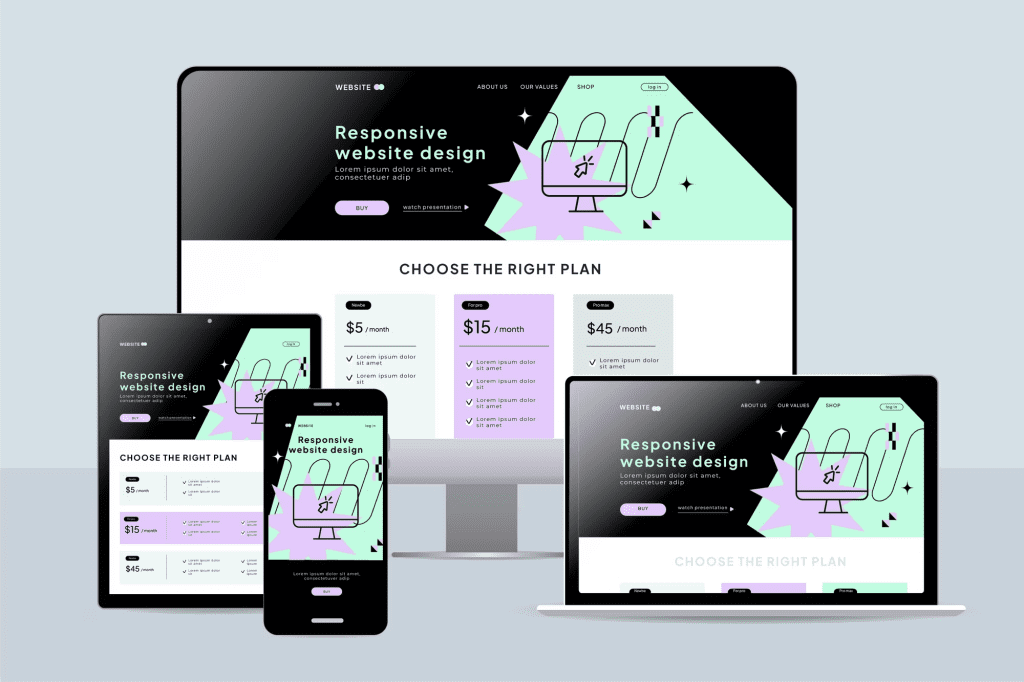
What Is Responsive Design And Why Is It Important For SEO?
- Understanding Responsive Design
- Importance of Responsive Design for SEO
- Benefits of Responsive Design for SEO
- How to Implement Responsive Design for SEO
- Responsive Design and Future SEO Trends
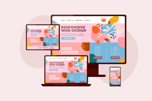
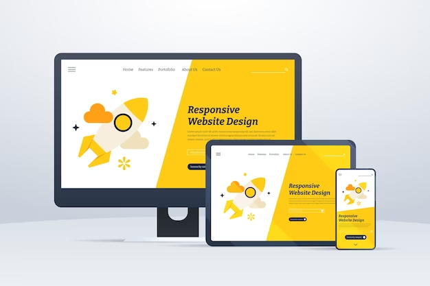
1. Understanding Responsive Design
In the realm of web development, responsive design is not merely a design choice; it is a strategic approach that ensures websites adapt seamlessly to the diverse array of devices users employ.
Let’s delve into the intricacies of responsive design, decoding its definition, core principles, and the evolutionary journey that has led it to become a cornerstone of contemporary web development.
Decoding Responsive Design: Definition and Purpose
Responsive design is a design philosophy that emphasizes crafting websites to provide an optimal viewing and interaction experience across a range of devices.
Unlike traditional designs that may struggle to render appropriately on various screen sizes, responsive design ensures that a website dynamically adjusts its layout and content presentation, regardless of the device being used.
- Key Elements of Responsive Design:
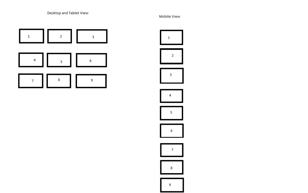
- Fluid Grids: The use of relative units like percentages instead of fixed units, enabling flexible layouts.
- Flexible Images: Employing CSS techniques to ensure images scale proportionally, maintaining clarity and aesthetics.
- Media Queries: Implementing CSS media queries to apply specific styles based on device characteristics like screen width.
A Journey Through the Evolution of Responsive Design
The genesis of responsive design can be traced back to the early 2010s when the proliferation of diverse devices sparked the need for a more adaptive web experience.
A pivotal moment was the introduction of Ethan Marcotte’s seminal article, “Responsive Web Design,” which laid the groundwork for the responsive design movement.
- Evolutionary Milestones:
- Mobile-First Approach: As mobile device usage surged, designers began adopting a mobile-first approach, prioritizing the creation of websites for mobile devices before scaling up for larger screens.
- Ethan Marcotte’s Contribution: In 2010, Ethan Marcotte introduced the term “responsive web design,” advocating for a flexible and fluid grid system.
Key Components: Building Blocks of Responsive Web Design
To truly understand responsive design, it’s essential to grasp its key components – the building blocks that transform static websites into dynamic, adaptable entities catering to the diverse needs of users.
- Media Queries in Action:
- Example: Consider a website employing a media query to adjust font size based on the user’s device. The CSS might include @media only screen and (max-width: 600px) { font-size: 14px; }, ensuring legibility on smaller screens.
- Fluid Grids in Practice:
- Example: Imagine a website using a fluid grid to divide its layout into columns, each sized proportionally. A three-column layout on a desktop might become a single column on a smartphone, maintaining readability and aesthetics.
- Flexible Images in Real-time:
- Example: A website incorporating flexible images would use CSS to ensure that images scale proportionally. An image that’s 100% of the container width on a desktop might automatically adjust to a lower percentage on a smaller screen.
2. Importance of Responsive Design for SEO
Responsive design isn’t just a design trend; it’s a strategic imperative in the world of SEO.
As search engines evolve, placing a greater emphasis on user experience, the role of responsive design becomes increasingly pivotal.
Let’s explore why having a responsive website is paramount for SEO success, backed by examples and data-driven insights.

Mobile-First Indexing: Google’s Algorithmic Shift
Google, the undisputed leader in search engines, has significantly altered its algorithm to reflect the mobile-centric nature of internet usage.
With the introduction of mobile-first indexing, Google predominantly uses the mobile version of the content for indexing and ranking.
This shift underscores the necessity for websites to prioritize mobile user experience.
According to Google, over 50% of web traffic comes from mobile, highlighting the prevalence of mobile usage in accessing online content.
User Experience: The Nexus of Responsive Design and SEO
The connection between user experience (UX) and SEO is more intertwined than ever.
Search engines, particularly Google, consider factors like bounce rate, time on site, and overall engagement as indicators of a positive user experience.
Responsive design plays a pivotal role in ensuring a seamless and user-friendly interface across devices.
Example: Consider a non-responsive website that forces mobile users to pinch, zoom, and scroll excessively to access content. Such a poor user experience can lead to higher bounce rates, negatively impacting SEO rankings.
Page Loading Speed: A Crucial Metric for SEO Rankings
Page loading speed is a crucial ranking factor for search engines, and responsive design contributes significantly to optimizing load times.
A website that loads swiftly on various devices not only enhances user satisfaction but also aligns with Google’s emphasis on delivering fast and efficient search experiences.
- According to Google, as page load time goes from one second to 10 seconds, the probability of a mobile site visitor bouncing increases by 123%.
- Example: Imagine a responsive e-commerce site that loads quickly on both desktops and mobile devices. The likelihood of users staying on the site and completing transactions increases, positively influencing SEO rankings.

3. Benefits of Responsive Design for SEO
Responsive design is not just a design philosophy; it’s a strategic investment that reaps significant rewards in the realm of Search Engine Optimization (SEO).
In this comprehensive exploration, we’ll dissect the myriad benefits that responsive design brings to the table.
Improved Mobile User Experience
One of the primary benefits of responsive design is its ability to provide a consistent and user-friendly experience across various devices, especially mobile.
As mobile usage continues to dominate the digital landscape, catering to this audience is imperative for SEO success.
- Google states that 53% of visits are abandoned if a mobile site takes longer than 3 seconds to load. Responsive design, by optimizing for mobile, helps mitigate potential frustrations and enhances user engagement.
- Example: Consider a responsive news website where articles adjust seamlessly to the screen size. Users accessing the site from mobile devices experience easy navigation and readable content without the need for constant zooming or horizontal scrolling.

Consistent Content and SEO Strategy
Consistency is key in the digital realm, and responsive design ensures that your content strategy remains uniform across devices.
This coherence not only contributes to a seamless user experience but also aligns with search engines’ preference for consistent and high-quality content.
- According to a study by Google, 90% of multiple device owners switch between screens to complete tasks, using an average of three different combinations every day, underscoring the need for consistency across various platforms.
- Example: An e-commerce site employing responsive design ensures that product information, pricing, and promotional content remain consistent whether accessed via desktop, tablet, or smartphone. This uniformity strengthens the site’s overall SEO strategy.

Higher Search Engine Rankings
Responsive design directly influences search engine rankings by aligning with the evolving algorithms of major search engines, particularly Google.
Google’s mobile-first indexing favours mobile-friendly websites, and responsive design ensures that your site is well-positioned to rank higher in search results.
- Google reports that 61% of users said that if they didn’t find what they were looking for right away on a mobile site, they’d quickly move on to another site, highlighting the impact of user experience on retention.
- Example: An online service provider, adopting responsive design, might see a significant improvement in its search rankings. With a mobile-friendly site, it attracts more organic traffic, positively influencing its SEO performance.
4. How to Implement Responsive Design for SEO
Implementing responsive design is not just about making a website visually appealing; it’s a strategic manoeuvre to enhance user experience and boost SEO rankings.
In this extensive guide, we will navigate the intricate process of implementing responsive design for SEO, supported by practical examples and data-driven insights.

Choosing the Right Responsive Design Framework
Selecting the appropriate responsive design framework is the first crucial step in ensuring a seamless user experience across devices.
Consider frameworks like Bootstrap, Foundation, or Tailwind CSS, which offer pre-built components and responsive grids.

Example: An e-commerce site opts for the Bootstrap framework, leveraging its responsive grid system. This allows the site to adapt fluidly to different screen sizes, providing an optimal shopping experience for users on various devices.
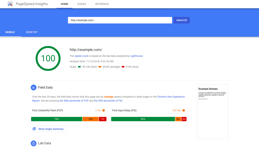
Testing and Optimization Strategies
Once the responsive design is implemented, rigorous testing is essential to identify and rectify any potential issues.
Utilize tools like Google’s PageSpeed Insights to assess the mobile-friendliness and performance of your site.
- Google’s research reveals that the probability of bounce increases by 32% as page load time goes from 1 second to 3 seconds.
- Example: A travel website undergoes thorough testing using PageSpeed Insights, identifying and rectifying issues that could hinder its performance on mobile devices. This optimization effort not only enhances user satisfaction but also positively influences SEO rankings.
Monitoring and Adapting to Algorithm Changes
The digital landscape is dynamic, with search engine algorithms continuously evolving.
Regularly monitor algorithm updates from major search engines, especially Google, and adapt your responsive design strategy accordingly.
- Google has switched to mobile-first indexing for all websites starting September 2020.
- Example: A news portal keeps a vigilant eye on Google’s algorithm updates. Upon learning about an impending algorithm change favouring mobile-first content, the portal proactively refines its responsive design to align with the new criteria.
5. Responsive Design and Future SEO Trends
As the digital landscape continues to evolve, responsive design stands as a linchpin in shaping the future of SEO.
In this extensive exploration, we’ll delve into emerging trends and the symbiotic relationship between responsive design and the evolving expectations of search engines.
The Growing Significance of Mobile Devices
Mobile devices have become ubiquitous, influencing the way users access and interact with online content.
As we peer into the future, the significance of mobile devices is poised to grow even further, necessitating a responsive design approach that prioritizes mobile user experience.
- In January 2023, mobile devices excluding tablets accounted for nearly 57 percent of web page views worldwide, emphasizing the dominance of mobile devices.
- Example: A lifestyle blog, anticipating the surge in mobile traffic, adopts a responsive design to ensure its articles are easily accessible and enjoyable on various screen sizes.
This foresight not only enhances user engagement but also aligns with the trajectory of mobile-centric trends.
Google’s Emphasis on User Experience
Google, as the predominant search engine, continues to refine its algorithms to prioritize user experience.
Future SEO trends are likely to place an even greater emphasis on factors such as page loading speed, mobile-friendliness, and overall usability.
Example: An e-commerce platform, foreseeing Google’s continued emphasis on mobile-friendliness, invests in responsive design to optimize its product pages for mobile users.
This strategic move not only aligns with current best practices but positions the platform favourably for future algorithmic shifts.
Anticipated Developments in Responsive Design
As technology advances, responsive design is expected to undergo further refinements and innovations. Future trends may include more sophisticated use of artificial intelligence (AI) to personalize user experiences based on device preferences and behaviours.
Example: A news aggregator employs AI-driven responsive design, customizing content recommendations based on a user’s device history. This not only enhances user engagement but also aligns with the futuristic trend of personalized digital experiences.

As we gaze into the future, the integration of responsive design into broader SEO strategies becomes imperative.
Websites that proactively adapt to emerging trends, especially those centred around mobile devices and user experience, are poised to stay ahead in the competitive realm of digital visibility.
Conclusion
In the dynamic and ever-evolving landscape of the digital era, where user experience reigns supreme, the significance of responsive design in shaping the trajectory of Search Engine Optimization (SEO) cannot be overstated.
As we draw the curtains on our exploration into “What Is Responsive Design and Why Is It Important for SEO?” the synthesis of aesthetics, adaptability, and strategic foresight emerges as the formula for digital triumph.
A Recap of Responsive Design’s Crucial Role in SEO
Responsive design, as we’ve unravelled throughout this comprehensive journey, transcends being a mere design philosophy; it’s a strategic imperative for websites aspiring to thrive in the competitive digital realm.
From its foundational principles and evolutionary milestones to the intricacies of implementation, responsive design emerges as the linchpin that bridges the gap between seamless user experience and SEO success.
Key Takeaways for Web Owners and Developers
For web owners and developers navigating the complexities of the digital terrain, the key takeaways are manifold.
Understanding the symbiotic relationship between responsive design and SEO is not just about aligning with current best practices but about future-proofing your digital presence.
The mobile-first indexing era, Google’s emphasis on user experience, and the anticipated developments in responsive design underscore the need for a forward-thinking approach.
Charting the Course: Encouraging Future-Ready Web Design Approaches
As we chart the course forward, the imperative is clear – embrace responsive design not as a checkbox on a development checklist but as an integral component of your digital strategy.
The future of SEO is intricately tied to the adaptability and user-friendliness of your website.
By staying attuned to emerging trends, selecting the right frameworks, testing rigorously, and monitoring algorithmic changes, web owners and developers can ensure their websites remain at the forefront of digital evolution.
Elevating the User Experience: A Holistic Approach
Responsive design is not a solitary endeavour but a harmonious integration of aesthetics and functionality, all in service of the end-user.
As we conclude this exploration, it’s paramount to recognize that the true measure of success lies not just in search engine rankings but in the satisfaction and engagement of the users who traverse the virtual corridors of your website.
In a world where adaptability is the key to digital triumph, responsive design stands as a testament to the ethos of user-centricity.
It’s not merely about creating websites; it’s about crafting digital experiences that seamlessly traverse the diverse landscape of devices, leaving an indelible mark on users and search engines alike.
As the digital journey continues, let responsive design be your compass, guiding you toward the shores of sustained SEO excellence and a future-ready digital presence.
If you are looking for a top-class digital marketer, then book a free consultation slot here.
If you find this article useful, why not share it with your friends and business partners, and also leave a nice comment below?
We, at the AppLabx Research Team, strive to bring the latest and most meaningful data, guides, and statistics to your doorstep.
To get access to top-quality guides, click over to the AppLabx Blog.
People also ask
Why is responsive design important for SEO?
Responsive design is crucial for SEO as it ensures optimal user experience across devices, aligning with Google’s mobile-first indexing. A mobile-friendly site enhances engagement, reduces bounce rates, and secures higher search rankings, reflecting the search engine’s emphasis on user-centricity and adaptability.
What is responsive design and why is it important?
Responsive design is a web development approach to crafting sites to adapt seamlessly across devices. Vital for user experience, it ensures consistent functionality, reduces bounce rates and aligns with search engine algorithms. Adaptability is key, making responsive design crucial for a successful online presence.
Why is responsive design important for modern websites?
Responsive design is vital for modern websites as it adapts layouts to various devices, providing an optimal user experience. With the dominance of mobile browsing, responsive design ensures accessibility, reduces bounce rates, and boosts SEO, making it an essential element for success in the digital era.


 Image Sizes in 2024: The Ultimate Guide")


