


")


")


Key Takeaways
- Strategic Symphony of Engagement: Learn to orchestrate a visual symphony above the fold for instant user connection, while crafting a compelling narrative below the fold for sustained engagement.
- SEO Chess Match: Understand the strategic moves above and below the fold that impact search engine rankings. Optimize for critical SEO metrics with insights from case studies and industry best practices.
- Mobile-Friendly Mastery: Adapt your web design strategies for the mobile era, emphasizing responsiveness and user-centric approaches to ensure a seamless experience above and below the fold on diverse devices.
In the dynamic cosmos of digital existence, the symbiotic relationship between web design and SEO emerges as a pivotal factor in shaping the success trajectory of online entities.
At the heart of this intricate dance lies a fundamental dichotomy – the strategic placement of content elements above and below the initial viewport.
Welcome to the explorative journey into the realm of “Above-the-Fold vs. Below-the-Fold in Web Design and SEO,” where we embark on a comprehensive analysis of the visual hierarchy that unfolds on a webpage and its profound implications for user engagement and search engine visibility.
Deciphering the Above-the-Fold Enigma: Crafting a Visual Symphony for Instant Impact
Imagine a virtual handshake between your website and its visitor, occurring at first glance.
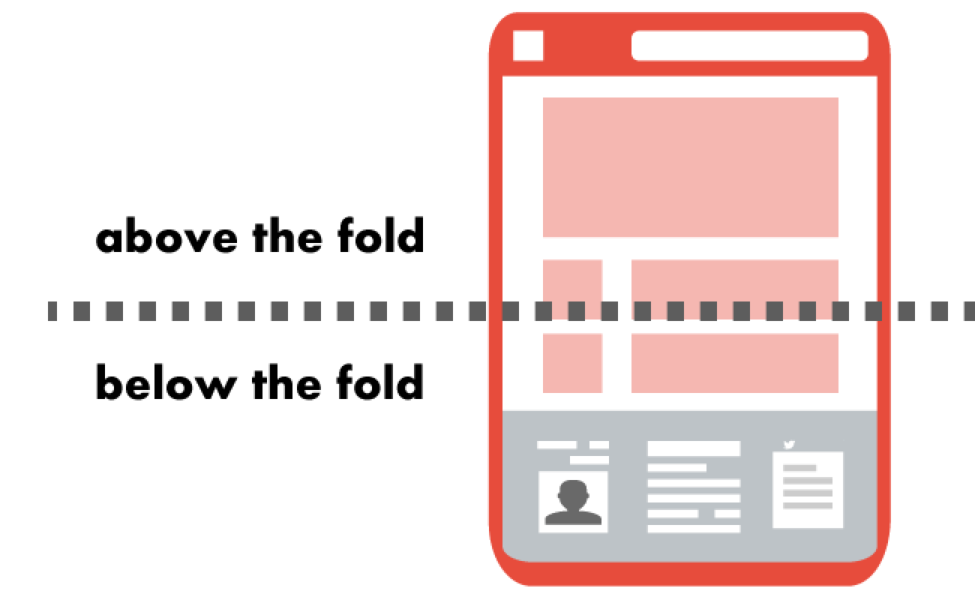
This instant connection encapsulates the essence of “Above-the-Fold” design – the portion of a webpage visible without the need for any scrolling.
As we delve into this paradigm, we dissect the core elements that define this digital real estate.
From the strategic placement of headers and navigation to the captivating allure of hero images or sliders, and the compelling call-to-action buttons, each component is a brushstroke in the canvas of instant visual engagement.
Join us in uncovering the art and science behind creating an immediate impact that transcends the initial screen real estate.
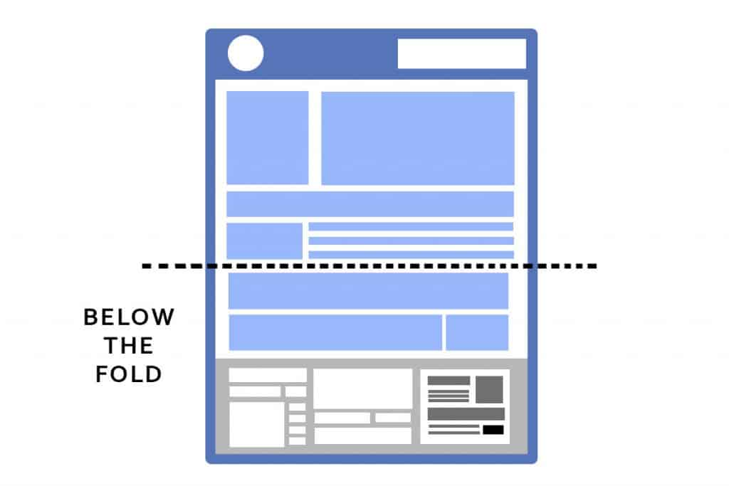
Beneath the Surface: Navigating the Depths of Below-the-Fold Elements in Web Design
While Above-the-Fold elements make the first impression, the narrative continues as users embark on a scrolling journey into the Below-the-Fold territory.
Here lies a canvas brimming with possibilities, where content hierarchy, textual richness, multimedia integration, and additional calls-to-action collectively contribute to a holistic user experience.
In this segment, we unravel the layers of Below-the-Fold elements, exploring how the strategic placement of content below the initial viewport plays a pivotal role in holding the user’s attention and guiding them through a seamless digital journey.
Join us as we navigate the depths of Below-the-Fold design, revealing the intricate patterns that contribute to a cohesive and engaging web experience.
SEO Chess: Strategic Moves Above-the-Fold and Below-the-Fold
The synergy between web design and SEO is not merely an aesthetic consideration but a strategic chess game that unfolds above and below the digital fold.
Above-the-fold elements impact crucial SEO metrics such as page load speed, mobile responsiveness, and overall relevance to search engine algorithms.
Simultaneously, Below-the-Fold content plays a crucial role in keyword optimization, internal linking, and fostering user engagement metrics.
In this chess match, we explore the SEO considerations tied to both design realms, empowering you with insights to elevate your website’s visibility and resonance in the vast landscape of search engine rankings.
In this comprehensive exploration, each layer unfolds a new dimension in the intricate tapestry of web design and SEO.
Join us as we traverse the nuanced terrain of the digital fold, where every pixel and every keyword contributes to the harmonious symphony of online presence.
Welcome to the nexus of design and optimization – where the fold becomes a canvas for innovation and strategic prowess in the dynamic world of the web.
But, before we venture further, we like to share who we are and what we do.
About AppLabx
From developing a solid marketing plan to creating compelling content, optimizing for search engines, leveraging social media, and utilizing paid advertising, AppLabx offers a comprehensive suite of digital marketing services designed to drive growth and profitability for your business.
AppLabx is well known for helping companies and startups use SEO to drive web traffic to their websites and web apps.
At AppLabx, we understand that no two businesses are alike. That’s why we take a personalized approach to every project, working closely with our clients to understand their unique needs and goals, and developing customized strategies to help them achieve success.
If you need a digital consultation, then send in an inquiry here.
Above-the-Fold vs. Below-the-Fold in Web Design and SEO
- Above-the-Fold Elements
- Below-the-Fold Components
- The Fold and User Behavior
- Mobile-Friendly Design and the Fold
- Testing and Optimization Strategies
1. Above-the-Fold Elements
In the digital realm, the Above-the-Fold (ATF) section serves as the virtual storefront, where first impressions are formed in the blink of an eye.
The careful orchestration of key elements within this immediate visual space holds the power to capture user attention, convey brand identity, and influence overall user experience.
Let’s dissect the crucial ATF elements and explore how they contribute to a captivating website introduction.

Headers and Navigation: The Gateway to Seamless Interaction
The header, positioned at the top of a webpage, is the navigational compass that directs users through the digital landscape.
Implementing clear and concise headers not only aids in SEO by signalling content hierarchy to search engines but also ensures a user-friendly experience.
Example: Amazon’s homepage header stands as a model of effective navigation. With a minimalist design, easily recognizable categories, and a prominent search bar, users can swiftly find what they’re looking for.

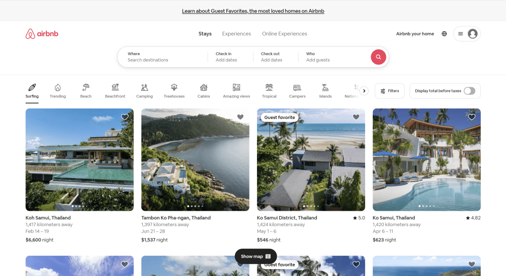
Hero Images or Sliders: Visual Storytelling for Immediate Impact
Hero images or sliders, positioned prominently ATF, are visual narratives that convey brand identity and message.
When judiciously selected, these images become powerful tools for storytelling and brand recall.
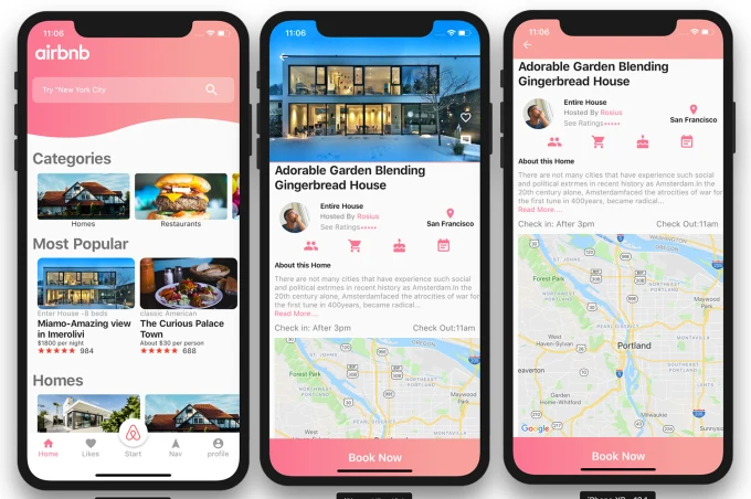
Example: The website Airbnb effectively utilizes hero images to showcase diverse travel destinations, fostering an emotional connection with users and enticing exploration.
Call-to-Action (CTA) Buttons: Nudging Users Toward Conversion
CTA buttons, strategically placed ATF, act as signposts guiding users toward desired actions.
Whether it’s making a purchase, signing up for a newsletter, or initiating contact, a well-designed CTA button significantly influences conversion rates.
Example: The “Sign Up” buttons on the homepage of Slack is a prime example. With a vibrant colour that stands out against the background and clear, actionable text, it encourages users to take the next step.

SEO Considerations for Above-the-Fold Elements
Beyond aesthetics and user experience, ATF elements play a crucial role in SEO.
Google’s algorithm considers the content and structure above the fold when determining page relevance.
Optimizing headers with relevant keywords, ensuring fast loading times, and maintaining mobile responsiveness are key factors that influence search engine rankings.
Faster loading times (along with other important signals) can contribute to higher rankings.
In crafting the ATF section, the marriage of aesthetics, user experience, and SEO considerations creates a digital storefront that not only captivates but also invites users to explore further.
2. Below-the-Fold Components
In the digital journey, the Below-the-Fold (BTF) territory is where the narrative extends beyond the initial glance, delving into the intricate layers of content hierarchy, multimedia integration, and user interaction.
This section explores the key components residing beneath the surface, examining their impact on user engagement, SEO, and the overall narrative of the webpage.
Content Placement and Hierarchy: Guiding Users Through a Seamless Experience
Content hierarchy is paramount in Below-the-Fold design, guiding users through a seamless digital journey.
Well-organized and compelling content below the fold can significantly impact user engagement.
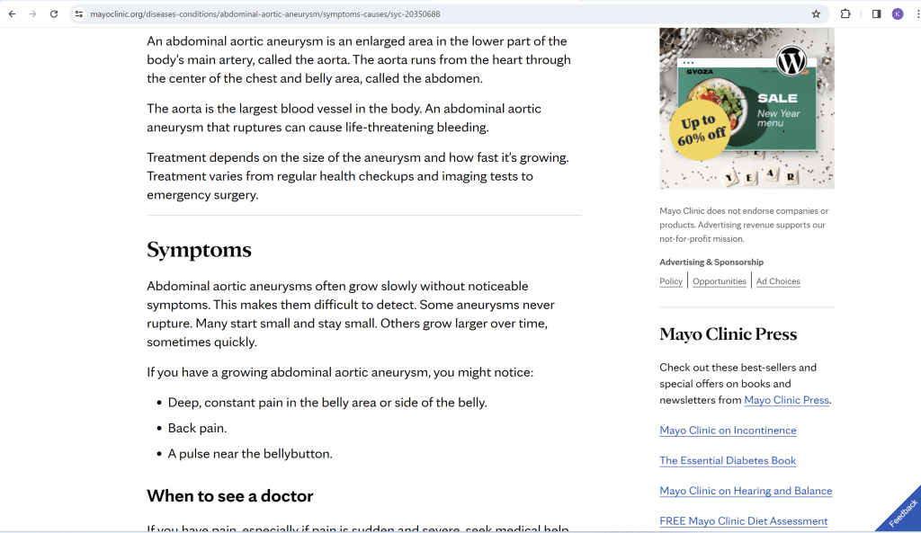
Textual Content: Crafting a Compelling Narrative
Textual content below the fold is an opportunity to provide in-depth information, answer user queries, and enhance the overall SEO of the page.
Example: On the Mayo Clinic’s website, detailed health information is presented below the fold, catering to users seeking comprehensive and trustworthy medical information.
Visuals and Multimedia: Enhancing Engagement and Dwell Time
The integration of visuals and multimedia below the fold contributes to a richer user experience.
Example: National Geographic’s website seamlessly incorporates visually stunning imagery and multimedia content below the fold, encouraging users to explore further.
Additional Calls-to-Action (CTAs) and Forms: Nurturing Conversions
BTF CTAs and forms play a pivotal role in converting user interest into action.
Example: HubSpot’s blog posts often include CTAs below the fold, inviting users to download related resources or subscribe to newsletters, enhancing user engagement.
SEO Best Practices Below-the-Fold
Optimizing Below-the-Fold content is crucial for comprehensive SEO. Including relevant keywords in the text, strategically placing internal links, and ensuring a positive user experience contribute to improved search rankings.
As the digital narrative unfolds below the fold, the strategic integration of textual content, multimedia elements, and conversion-focused CTAs not only enhances user engagement but also contributes to the overall SEO prowess of a webpage.
3. The Fold and User Behavior
The digital fold acts as a pivotal juncture where user behaviour intertwines with web design strategies, shaping the trajectory of online engagement.
In this section, we unravel the intricacies of user behaviour above and below the fold, exploring the patterns, preferences, and strategies that influence the overall digital experience.

Understanding User Scrolling Habits: Navigating the Digital Landscape
Understanding how users navigate and interact with content above and below the fold is fundamental to effective web design.
Web visitors spend 57% of their page-viewing time above the fold, emphasizing the critical importance of captivating elements in this immediate visual space.
Example: The website Spotify strategically uses above-the-fold space to showcase personalized music recommendations, enticing users to explore further without scrolling.

Balancing Design and Content for User Engagement: A Delicate Equilibrium
The interplay between design and content influences user engagement. A cohesive blend of visually appealing design elements and relevant content can significantly impact the user’s decision to scroll and delve deeper into the digital narrative.
Example: Apple’s website seamlessly integrates minimalist design elements above the fold with clear CTAs, providing a visually enticing yet informative experience.
The Impact of Mobile Responsiveness on User Interaction: A Cross-Device Perspective
As users increasingly access content on mobile devices, understanding how the fold translates to smaller screens is crucial.
Responsive design principles ensure a seamless experience, with mobile users exhibiting distinct scrolling behaviours influenced by screen size and interaction patterns.
In the last quarter of 2023, mobile devices (excluding tablets) generated 58.67 per cent of global website traffic.
In the dynamic landscape of user behaviour, the fold serves as a pivotal point of interaction, influencing engagement patterns and shaping the overall digital journey.
By strategically balancing design aesthetics, captivating content, and responsiveness to diverse devices, businesses can optimize the user experience both above and below the fold.
4. Mobile-Friendly Design and the Fold
In the era of mobile dominance, the significance of mobile-friendly design is paramount.
This section explores the nuances of designing for the fold on smaller screens, emphasizing the need for responsiveness and user-centric strategies to enhance the mobile browsing experience.

Responsive Design Principles: Adapting to Diverse Screen Sizes
Responsive design is the cornerstone of ensuring a seamless user experience across a spectrum of devices.
Leveraging responsive design principles enables the adaptation of content placement and design elements to fit various screen sizes, ensuring that the fold remains strategically positioned for optimal user interaction.
How Above-the-Fold and Below-the-Fold Translate to Mobile: A Vertical Perspective
On mobile devices, the concept of the fold is translated into a vertical orientation.
Above-the-fold content is the immediate visual space users encounter upon landing on a mobile page, while Below-the-Fold extends beyond the initial viewport, accessible through scrolling.
This vertical narrative requires careful consideration of content hierarchy and user interaction patterns.
Example: The mobile version of CNN strategically places breaking news headlines and images above the fold, encouraging users to scroll for more news updates.

Mobile SEO Implications for Fold Considerations: Speed and Accessibility
Mobile-friendly design directly impacts SEO performance, with search engines prioritizing mobile-friendly pages.
Google’s mobile-first indexing means that the mobile version of a page is considered the primary version for ranking.
Ensuring that mobile content, including that above and below the fold, is optimized for speed and accessibility is crucial for search engine visibility.
Strategic Adaptations for Mobile-Focused Fold Considerations: User-Centric Approaches
Designing for the mobile fold necessitates strategic adaptations to cater to user preferences and limitations.
Implementing concise headlines, easily tappable CTAs, and minimizing unnecessary elements contribute to a streamlined mobile experience.
User engagement metrics such as bounce rates and time-on-site are closely tied to the effectiveness of mobile-friendly fold strategies.
Example: Airbnb’s mobile app strategically showcases visually appealing property images above the fold, with clear and concise CTAs for users to explore further, creating a seamless mobile experience.
The Evolution of Mobile-Friendly Design: Future-Forward Considerations
As technology advances and user expectations evolve, the landscape of mobile-friendly design continues to transform.
Future considerations include emerging technologies such as progressive web apps (PWAs) and the integration of voice search, emphasizing the need for continual adaptation and innovation in mobile design strategies.
In navigating the compact digital landscape of mobile devices, prioritizing mobile-friendly design is not only a user-centric approach but a strategic imperative for SEO success.
By aligning design elements above and below the mobile fold with user behaviours and search engine requirements, businesses can optimize their online presence for the mobile era.
5. Testing and Optimization Strategies
In the ever-evolving landscape of web design and SEO, the commitment to continuous improvement is paramount.
This section delves into robust testing and optimization strategies, exploring methodologies, case studies, and key performance indicators (KPIs) to empower businesses in their quest for digital excellence.

A/B Testing for Above-the-Fold Elements: Refining the Initial Impression
A/B testing, also known as split testing, is a methodical approach to compare two versions of a webpage and determine which performs better.
When applied to Above-the-Fold elements, A/B testing allows businesses to refine the initial impression by comparing variations in headers, hero images, and CTAs.
User Feedback and Heatmap Analysis: Uncovering User Preferences
Gaining insights into user preferences is crucial for refining design elements and content placement.
User feedback and heatmap analysis provide valuable data on how users interact with a webpage, guiding optimizations for both Above-the-Fold and Below-the-Fold components.
Continuous Optimization for SEO Performance: Staying Ahead in Rankings
SEO optimization is an ongoing process, and regular monitoring and adjustments are essential.
Employing SEO tools to analyze keyword performance, track search engine rankings, and evaluate user engagement metrics contributing to continuous optimization.
Example: Moz’s Keyword Explorer allows businesses to track the performance of target keywords over time, identifying trends and opportunities for optimization.
A/B Testing for Below-the-Fold Components: Refining the Extended Narrative
Extending A/B testing to Below-the-Fold components is equally crucial for refining the extended narrative and user journey.
Testing variations in content placement, multimedia integration, and CTAs below the fold helps in optimizing for user engagement and conversions.
The shorter form resulted in a 20% increase in conversion rates.
Harnessing Continuous Feedback Loops: Iterative Excellence
Feedback loops, integrating insights from user feedback, analytics, and testing, create an iterative process of refinement.
By harnessing continuous feedback loops, businesses can adapt to evolving user behaviors and preferences, ensuring sustained digital excellence.
Future-Proofing with Emerging Technologies: Anticipating Trends
Staying ahead in the digital landscape involves anticipating future trends and adapting to emerging technologies.
From integrating voice search optimization to exploring the potential of artificial intelligence (AI) in testing, businesses can future-proof their online presence.
In the dynamic realm of web design and SEO, testing, and optimization strategies serve as the compass for navigating change and achieving sustained digital success.
By leveraging data-driven insights, embracing user feedback, and staying abreast of emerging trends, businesses can fine-tune their online presence for the evolving digital landscape.
Conclusion
In the expansive landscape of web design and SEO, the interplay between Above-the-Fold (ATF) and Below-the-Fold (BTF) elements is akin to orchestrating a symphony where each note contributes to the overall harmony of user engagement and search engine visibility.
As we conclude our exploration into the dichotomy of the digital fold, it becomes evident that the strategic placement and optimization of elements above and below the fold hold the key to unlocking a website’s full potential.
Harmonizing First Impressions with ATF Brilliance
Above-the-fold emerges as the virtual handshake, the initial interaction between a website and its visitor.
From headers and navigation to captivating hero images and compelling CTAs, ATF elements craft a visual symphony that captivates users at first glance.
Unveiling the Depths with BTF Elegance
Below-the-Fold, however, extends the narrative beyond the immediate visual space, fostering a holistic user experience.
Content hierarchy, multimedia integration, and additional calls-to-action weave a rich tapestry that holds users’ attention and guides them through a seamless digital journey.
SEO Chess: Strategic Moves for Digital Dominance
The synergy between web design and SEO is not a passive engagement but a strategic chess match where each move above and below the fold influences search engine rankings.
Above-the-Fold elements impact critical SEO metrics such as page load speed and mobile responsiveness, while Below-the-Fold content plays a role in keyword optimization and user engagement.
Responsive Design: Adapting to the Mobile Era
In an era dominated by mobile devices, the concept of the fold takes on a vertical orientation.
Mobile-friendly design, with a keen focus on responsiveness and user-centric approaches, is not merely an option but a necessity.
Continuous Refinement: The Essence of Digital Excellence
Testing and optimization strategies serve as the compass guiding businesses through the ever-evolving digital landscape. Whether through A/B testing, user feedback, or harnessing emerging technologies, the journey toward digital excellence is iterative.
Insights from Moz’s Keyword Explorer, Hotjar’s State of User Feedback survey, and adaptation to voice search trends exemplify the commitment to continuous refinement for sustained success.
In the grand tapestry of web design and SEO, the fold is not a limitation but a canvas for innovation and strategic prowess.
As we navigate this dynamic landscape, the key takeaway is that Above-the-Fold and Below-the-Fold are not opposing forces but complementary elements that, when orchestrated harmoniously, create a user-centric and search engine-friendly masterpiece.
It is through this delicate balance, strategic optimizations, and continuous refinement that websites can rise above the digital noise and make a lasting impact in the vast expanse of the online realm.
Welcome to the nexus of design and optimization, where the fold becomes a gateway to digital brilliance and sustained success.
If you are looking for a top-class digital marketer, then book a free consultation slot here.
If you find this article useful, why not share it with your friends and business partners, and also leave a nice comment below?
We, at the AppLabx Research Team, strive to bring the latest and most meaningful data, guides, and statistics to your doorstep.
To get access to top-quality guides, click over to the AppLabx Blog.
People also ask
Does the above-the-fold affect SEO?
Yes, Above-the-Fold (ATF) elements significantly impact SEO. Search engines prioritize content in this immediate visual space, influencing page relevance and user experience. Optimizing ATF for speed, mobile responsiveness, and strategic keywords enhances search engine rankings and overall online visibility.
What is the difference between above the fold and below the fold?
Above the Fold (ATF) refers to content visible without scrolling on a webpage. Below the Fold (BTF) is content appearing after scrolling. ATF captures initial user attention, while BTF provides a deeper narrative. Both influence user engagement and SEO strategies in web design.
What does above the fold mean in website design?
Above the Fold (ATF) in website design refers to the portion of a webpage visible without scrolling. It includes key elements like headers, hero images, and CTAs, capturing immediate user attention. ATF is crucial for making a positive first impression and influencing user engagement.


 Image Sizes in 2024: The Ultimate Guide")

")
