


")


")


Key Takeaways
- Strategic Design for Impact: Learn to craft visually compelling YouTube thumbnails by mastering design principles, color psychology, and typography to captivate your audience.
- Mobile-Friendly Mastery: Optimize your thumbnails for diverse devices, ensuring clarity on smaller screens and leveraging mobile-centric design strategies to boost engagement.
- Data-Driven Success: Elevate your content strategy with A/B testing and analytics insights. Discover how data-driven refinement can significantly enhance click-through rates and overall video performance.
Welcome to the digital realm where visual allure reigns supreme – a universe governed by clicks, views, and the irresistible allure of YouTube thumbnails.
If you’re a content creator navigating the vast landscape of online video, you already understand the pivotal role thumbnails play in the success of your channel.
These small yet mighty images serve as the gatekeepers to your content, enticing viewers to take that crucial first step – the click.
In this Ultimate Guide, we delve deep into the art and science of crafting YouTube Thumbnails that not only capture attention but also compel users to dive into your video content.
From understanding the technical specifications to unlocking the secrets of design psychology, this comprehensive resource is your roadmap to mastering the thumbnail game.
The Unseen Power of Thumbnails
In an ocean of digital content, YouTube thumbnails are the beacons that guide viewers to your shores. A compelling thumbnail is your digital storefront, displaying a tantalizing glimpse of the content within.
It’s the difference between being lost in the algorithmic abyss and standing out as a beacon of intrigue. As YouTube continues to dominate the online video space, the significance of thumbnails has never been more pronounced.
Why Thumbnails Matter More Than Ever
As the battle for attention rages on, YouTube thumbnails have emerged as the unsung heroes of content discovery. Beyond serving as mere visual placeholders, they are the silent persuaders that influence a user’s decision to click or scroll past.
In an era where attention spans are fleeting, and competition is fierce, a meticulously designed thumbnail is your secret weapon.
The Ultimate Guide Unveiled
Embark on a journey through the intricacies of thumbnail design, where each pixel holds the potential to captivate and convert.
This guide is more than a tutorial; it’s a comprehensive exploration of the symbiotic relationship between visual aesthetics and viewer psychology.
Whether you’re a seasoned content creator seeking to revamp your approach or a newcomer navigating the captivating world of YouTube, this guide is tailored to elevate your thumbnail game.
What Lies Ahead
Next, we demystify the technical aspects of thumbnail creation, explore the psychology behind design choices, and provide actionable insights backed by real-world examples.
From the intricacies of colour theory to the impact of mobile viewing, we leave no stone unturned in this quest for thumbnail mastery.
Get ready to unlock the secrets of the YouTube algorithm, captivate your audience at first glance, and witness the transformative power of thumbnails.
The Ultimate Guide awaits, offering a roadmap to not just designing thumbnails but creating visual narratives that resonate with your audience and propel your channel to new heights.
Let’s embark on this journey together, where pixels become storytellers and thumbnails wield the magic of content discovery.
Welcome to the Ultimate Guide to Designing YouTube Thumbnails – your passport to digital visibility and channel success.
Before we venture further, we like to share who we are and our digital experiences.
About AppLabx
From developing a solid marketing plan to creating compelling content, optimizing for search engines, leveraging social media, and utilizing paid advertising, AppLabx offers a comprehensive suite of digital marketing services designed to drive growth and profitability for your business.
AppLabx is well known for helping companies and startups leverage YouTube marketing to drive web traffic to their websites and web apps.
At AppLabx, we understand that no two businesses are alike. That’s why we take a personalized approach to every project, working closely with our clients to understand their unique needs and goals, and developing customized strategies to help them achieve success.
If you need a digital consultation, then send in an inquiry here.
YouTube Thumbnails: The Ultimate Guide To Designing Them
- Understanding the Basics
- Design Principles for Eye-Catching Thumbnails
- Tools and Software for Thumbnail Design
- Thumbnail Elements for Click-Worthy Content
- Best Practices for Mobile-Friendly Thumbnails
- A/B Testing and Analytics for Thumbnail Performance
- Avoiding-Common-Thumbnail-Mistakes
1. Understanding the Basics
Thumbnail Dimensions and Specifications
Dimensions Matter
YouTube thumbnails are like digital first impressions, and their dimensions play a pivotal role in how they are displayed across various platforms.
YouTube recommends a resolution of 1280×720 pixels for thumbnails.
Ensuring your thumbnails meet these specifications ensures optimal visibility and clarity across devices.
Pro Tip: Opt for high-resolution images to future-proof your content against advancements in display technology.
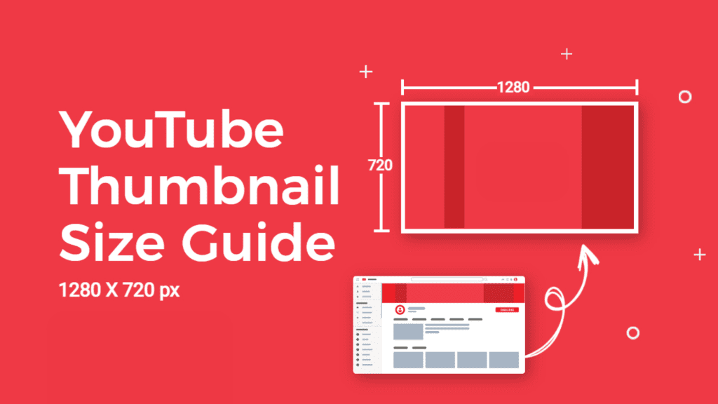
Aspect Ratios and Composition
YouTube thumbnails follow a 16:9 aspect ratio, aligning with standard video dimensions.
This consistency provides a cohesive visual experience for viewers as they navigate through different content.
When crafting thumbnails, consider centralizing key elements to maintain clarity, especially when viewed on smaller screens or mobile devices.
Example: Channels like “Tech Insider” consistently adhere to the 16:9 ratio, ensuring a seamless visual experience for their audience.
Pixel Perfect: Importance of High-Resolution
Crispness Counts
Pixelation is the enemy of visual appeal. High-resolution thumbnails not only look more professional but also convey a sense of quality and attention to detail.
A higher-resolution image enables viewers to discern more minute details and gives them a greater sense of assurance regarding the accuracy of their perceptions of the scene.
Catering to Retina Displays
With the proliferation of devices equipped with retina displays, ensuring your thumbnails are optimized for such screens is crucial.
Retina displays demand higher pixel density, meaning standard or low-resolution thumbnails might appear blurry or pixelated, potentially turning away viewers.
Branding Elements in High Resolution
Whether it’s your logo, a consistent colour palette, or specific font choices, maintaining high resolution across branding elements in thumbnails reinforces brand recognition.
As viewers scroll through recommended videos, a recognizable brand identity can significantly increase click-through rates.
Example: The YouTube channel “TED-Ed” incorporates high-resolution branding elements in their thumbnails, contributing to their widespread recognition and engagement.
Typography Tips for Better Readability
Font Size and Style
Choosing the right font size and style is akin to selecting the tone of your thumbnail’s voice.
It should be legible across devices and complement the overall aesthetic.
Bold, sans-serif fonts often work well, ensuring readability even in smaller thumbnail sizes.
Contrast for Clarity
In the thumbnail landscape, contrast is your ally. Ensure text stands out against the background, utilizing color variations to enhance readability.
A well-contrasted thumbnail not only captures attention but also communicates information effectively.
Example: The gaming channel “PewDiePie” often employs high-contrast text against vibrant backgrounds, contributing to the visibility of their videos in crowded genres.
Cohesive Visual Style: Crafting a Recognizable Aesthetic
Consistency Across Thumbnails
Creating a cohesive visual style is like designing a signature for your channel.
Consistency fosters familiarity, making it easier for viewers to identify your content amidst a sea of recommendations.
This extends beyond just color schemes, encompassing overall design elements.
Example: The beauty and lifestyle channel “Zoe Sugg” (Zoella) maintains a consistent visual style, creating a visually harmonious feed that attracts and retains viewers.

Thematic Elements
Incorporating thematic elements that resonate with your content genre establishes a visual language.
Whether it’s recurring symbols, specific color schemes, or stylized borders, these thematic elements become a visual cue for your audience.
In understanding these basics, you’re not just designing thumbnails; you’re architecting a visual journey for your audience. Stay tuned as we delve deeper into the psychology of design in the next segment of our Ultimate Guide.
2. Design Principles for Eye-Catching Thumbnails
Crafting thumbnails that stand out in the vast ocean of content requires an understanding of design principles that go beyond aesthetics.
In this section, we explore the psychology of design, leveraging colour theory, contrast, and typography to create thumbnails that not only grab attention but also entice viewers to click.
Color Psychology in Thumbnail Design
The Language of Hues
Colours speak a silent language, evoking emotions and influencing perceptions. In thumbnail design, leveraging colour psychology strategically can be a game-changer. Consider the emotional response you want to evoke in your audience and select colours that align with your content.
According to a study, 90% of snap judgments made on products can be based on colour alone, depending on the product, emphasizing the psychological impact of colour on decision-making.
Vibrancy and Visibility
In the crowded landscape of YouTube recommendations, vibrant colours can make your thumbnail pop. However, striking the right balance is crucial. Overly saturated colours might appear garish, while muted tones may go unnoticed.
Example: The beauty and fashion channel “NikkieTutorials” often incorporates vibrant, eye-catching colours in their thumbnails, contributing to their high click-through rates.
Effective Use of Contrast and Saturation
Contrast for Clarity
One of the fundamental principles of design, contrast, is equally applicable in thumbnail creation.
Ensuring a clear distinction between the subject and the background enhances visibility, especially when viewed on smaller screens or in fast-scrolling environments.
Saturation to Command Attention
Strategic use of saturation can draw attention to specific elements within a thumbnail. Bold, saturated colours can guide the viewer’s gaze, directing them towards crucial components like text or the main focal point.
Typography Tips for Better Readability
Font Selection for Impact
Typography is not just about choosing a font; it’s about selecting a visual language for your thumbnail. Fonts convey tone and personality, influencing how viewers perceive your content. Opt for bold, easily readable fonts that align with your brand identity.
Example: The technology review channel “Marques Brownlee” uses a clean, sans-serif font in their thumbnails, maintaining readability even at smaller sizes.
Size Matters
Regarding text in thumbnails, the size should be optimized for legibility across devices.
Consider how the thumbnail appears on mobile screens, where a significant portion of YouTube viewers engage with content.
Creating a Cohesive Visual Style for Your Channel
The Power of Recognition
Consistency is not just a design principle; it’s a strategy for brand recognition.
A cohesive visual style across your thumbnails builds a visual identity for your channel, making it easier for viewers to identify your content amidst a sea of recommendations.
Pro Tip: Conduct an audit of successful channels in your niche to identify common visual elements and incorporate them into your design strategy.
Thumbnail Templates for Efficiency
Streamline your thumbnail creation process by establishing templates that align with your brand.
Consistent layouts, color schemes, and positioning of elements create a unified visual experience for your audience.
Example: Gaming channels like “Markiplier” often use consistent thumbnail templates, contributing to a visually cohesive feed that appeals to their target audience.
Incorporating these design principles into your thumbnail creation process can significantly elevate the visual appeal of your content.
As we delve deeper into the intricacies of thumbnail elements in the next segment, you’ll discover how to strike the perfect balance between visuals and information for click-worthy thumbnails. Stay tuned!
3. Tools and Software for Thumbnail Design
Creating visually stunning YouTube thumbnails is a craft that demands the right set of tools and software.
In this comprehensive guide, we’ll explore an array of graphic design platforms, both free and premium, that can empower content creators to craft eye-catching thumbnails, captivate audiences, and elevate their online presence.
Overview of Popular Graphic Design Tools
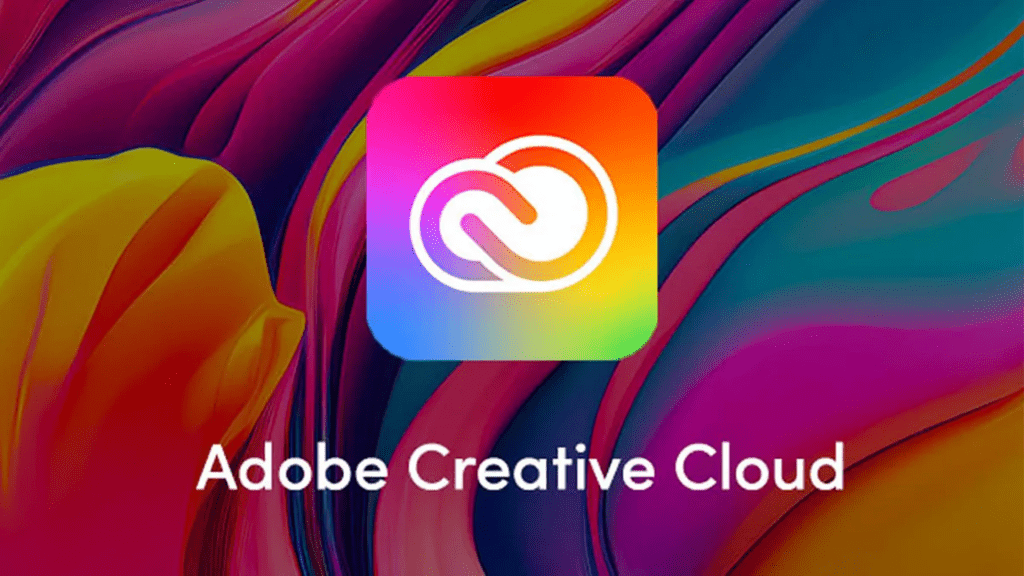
Adobe Creative Cloud
Adobe’s Creative Cloud suite, encompassing industry-standard software like Photoshop and Illustrator, stands as the go-to choice for professional-level graphic design.
With robust features and unmatched versatility, it caters to creators who seek intricate and customized thumbnail designs. In the middle of 2022, Creative Cloud has around 23 million active users, underlining its dominance in the creative community.
Canva
Canva has emerged as a democratizing force in graphic design, offering a user-friendly platform that caters to both beginners and seasoned creators.
Its intuitive drag-and-drop functionality and vast library of templates make it a popular choice for those prioritizing efficiency without compromising quality.
PicMonkey
For creators who value speed and simplicity, PicMonkey provides a quick and effective solution.
This online design tool offers templates and features for rapid yet impactful thumbnail creation, making it accessible to creators at any skill level.
Example: PicMonkey has gained popularity, boasting millions of users who leverage its platform for various design needs.
Tips for Beginners and Advanced Users
Beginners’ Tips
- Start with Templates: For newcomers, leverage pre-designed templates provided by platforms like Canva. This helps you grasp design principles without starting from scratch.
- Limit Text and Elements: Maintain a clean and uncluttered design. Limit the amount of text and additional elements to ensure a visually appealing thumbnail.
Advanced Users’ Strategies
- Layering Techniques: Platforms like Photoshop allow advanced users to experiment with layering techniques, creating depth and complexity in their thumbnails.
- Custom Brush and Filter Effects: Utilize custom brushes and filters to add unique textures or effects, setting your thumbnails apart from standard designs.
Thumbnail Design Best Practices Across Tools
Consistency in Branding
Regardless of your chosen tool, maintaining consistency in branding elements across your thumbnails is crucial for audience recognition. Use consistent colour palettes, fonts, and logos to establish a visual identity.
When it comes to your brand, the colour palette you choose can increase your brand recognition by up to 80%, emphasizing the importance of consistent branding (CXL).
4. Thumbnail Elements for Click-Worthy Content
Mastering the art of creating click-worthy thumbnails is akin to unlocking the gateway to increased viewership and engagement on YouTube.
In this detailed exploration, we delve into the key elements that make thumbnails irresistible, from compelling visuals to strategic text placement.
Compelling Visuals: The Heart of Click-Worthy Thumbnails
Striking Imagery for Instant Impact
- High-Quality Imagery: Use high-resolution images to ensure clarity and professionalism.
Example: The photography channel “Peter McKinnon” consistently employs high-quality visuals in thumbnails, contributing to their visual appeal. - Focal Point Dominance: Ensure a clear focal point that stands out, guiding the viewer’s attention. This can be achieved through color contrast, focus, or central positioning
Incorporate emotions in visuals to establish a connection with viewers. Faces expressing emotions tend to attract attention and evoke engagement.

Incorporating Faces and Emotions: Humanizing Thumbnails
The Power of Faces in Thumbnails
- Expressive Faces: Feature expressive faces relevant to the content to evoke curiosity and emotional connection.
A study found that images with faces receive 38% more likes on Instagram, underscoring the impact of human connection in visual content. - Eye Contact: Direct eye contact establishes a personal connection with the viewer, increasing the likelihood of clicks.
- Consistent Branding in Faces: If using faces, ensure consistency in style, expressions, or colour tones to establish a recognizable brand identity.
Example: Lifestyle vlogger “Zoe Sugg” (Zoella) consistently incorporates her face in thumbnails with a consistent style, contributing to brand recognition.
Balancing Text and Imagery: The Art of Information Delivery
Strategic Text Placement for Clarity
- Text-to-Image Ratio: Strike a balance between text and visuals. Too much text can clutter the thumbnail, while too little may not convey enough information.
YouTube recommends keeping text concise and limiting it to key information to maintain viewer interest. - Contrast for Visibility: Use colour contrast between text and background to enhance readability, especially for viewers on mobile devices.
Testing and Optimizing Thumbnails: Data-Driven Improvement
A/B Testing for Performance Enhancement
- Experiment with Variations: Use A/B testing to upload variations of thumbnails and analyze performance metrics. YouTube’s built-in analytics provide valuable insights into click-through rates
Iteratively refine thumbnails to align with audience preferences. Regularly revisit and update thumbnails for optimal performance.
5. Best Practices for Mobile-Friendly Thumbnails
In an era where mobile devices dominate content consumption, ensuring your thumbnails are mobile-friendly is paramount for capturing viewer attention and driving engagement.
In this comprehensive guide, we explore the key best practices to optimize your thumbnails for mobile users.
Understanding Mobile Viewing Landscape
Mobile Dominance in Content Consumption
- Mobile Traffic Surge: In the first quarter of 2023, mobile devices (excluding tablets) generated 58.33 per cent of global website traffic.
- Varied Screen Sizes: Mobile users access content across a spectrum of screen sizes and resolutions, emphasizing the need for thumbnails to be visually effective across diverse devices.
Optimizing Thumbnail Dimensions for Mobile Devices
Responsive Dimensions for All Screens
- Follow YouTube’s Recommendations: Adhere to YouTube’s recommended thumbnail dimensions (1280×720 pixels) but ensure that crucial elements are not placed near the edges to prevent cropping on smaller screens.
- Test on Multiple Devices: Regularly test your thumbnails on various devices to ensure they remain visually compelling and readable across different screen sizes.
Simplifying Designs for Clarity on Smaller Screens
Streamlined Visuals for Maximum Impact
- Avoid Clutter: Simplify your thumbnail design to prevent visual clutter, ensuring that key elements are easily discernible on smaller screens.
Example: Channels like “Techquickie” maintain visually streamlined thumbnails, optimizing for clarity on various devices. - Large and Readable Text: Use bold and easily readable fonts with a size that remains legible even on smaller screens.
Strategic Use of Colors and Contrast
Color Considerations for Mobile Visibility
- High Contrast Elements: Utilize high contrast between text and background to enhance visibility, especially considering the limitations of smaller screens.
- Color Psychology for Mobile Users: Leverage colors strategically, considering the emotional impact on viewers even on smaller screens.
Mobile Testing and Optimization
Continual Iteration for Mobile Success
- A/B Testing on Mobile Devices: Conduct A/B testing specifically for mobile users to understand how different thumbnail variations perform on smaller screens.
- Iterative Improvements: Regularly revisit and optimize thumbnails based on mobile performance data, adapting to the ever-evolving landscape of mobile devices.
6. A/B Testing and Analytics for Thumbnail Performance
In the dynamic realm of YouTube content creation, understanding the nuances of A/B testing and harnessing the power of analytics are essential elements in crafting compelling and high-performing thumbnails.
In this detailed exploration, we dive into the methodologies, benefits, and real-world examples that showcase the impact of A/B testing and analytics on thumbnail performance.
The Science Behind A/B Testing: Elevating Thumbnail Effectiveness
Introduction to A/B Testing
- Defining A/B Testing: A/B testing involves creating two or more variations of a thumbnail and measuring their performance to identify which version resonates best with the audience.
YouTube creators often leverage A/B testing to refine thumbnails, increase click-through rates, and enhance overall video performance. - Elements for Testing: Thumbnails can be tested for various elements, including colors, text placement, font styles, imagery, and overall design.
Setting Up A/B Tests: Methodologies for Success
Key Steps in A/B Testing
- Identifying Variables: Begin by selecting a specific element or elements within the thumbnail to test. This could be the color scheme, text size, or the use of faces.
- Creating Variations: Develop multiple versions of the thumbnail, ensuring that each variant differs only in the identified variable.
- Randomized Distribution: Distribute the different thumbnail variations randomly to your audience to ensure unbiased results.
YouTube provides a built-in A/B testing feature that allows creators to test different thumbnails with a portion of their audience.
Analytics for Thumbnail Performance: Data-Driven Refinement
The Role of YouTube Analytics
- Click-Through Rate (CTR): CTR measures the percentage of viewers who click on your video after seeing the thumbnail. Analyze CTR data to understand which thumbnails are more effective.
Half of all channels and videos on YouTube have an impressions CTR that can range between 2% and 10%. - Impressions and Views: Track the number of impressions (how many times your thumbnail is shown) and views to gauge the overall visibility and engagement of your content.
YouTube Analytics provides a detailed breakdown of impressions, helping creators gauge the reach of their thumbnails. - Watch Time: Examine the watch time generated by videos associated with specific thumbnails. This metric provides insights into how engaging your content is after the initial click.
Iterative Improvements: Evolving Thumbnails Based on Data
Implementing Learnings from A/B Tests and Analytics
- Identify Successful Elements: Analyze A/B test results and analytics to identify which elements contribute to higher engagement, be it colour choices, text styles, or overall design.
- Continuous Refinement: Regularly update and optimize thumbnails based on A/B test insights and performance analytics. The YouTube algorithm favors fresh content and adaptability.
7. Avoiding Common Thumbnail Mistakes
In the visual landscape of YouTube, thumbnails serve as the gateway to audience engagement. However, certain pitfalls can hinder their effectiveness.
In this comprehensive guide, we explore common mistakes that creators often make with their thumbnails and provide insights on how to steer clear of these pitfalls.
Cluttered and Busy Designs: Simplifying for Impact
The Pitfall of Visual Overload
- Overloading with Text: Avoid cramming excessive text into thumbnails. Viewers often scroll quickly, and cluttered text can be overwhelming, diminishing the visual impact.
- Busy Backgrounds: Steer clear of intricate or overly busy backgrounds. A cluttered visual environment can distract viewers and make it challenging to discern the main message.
Misleading Thumbnails: Building Trust with Authenticity
Deceptive Imagery and Clickbait Tactics
- Misleading Imagery: Avoid using images that misrepresent the content of the video. Deceptive thumbnails may lead to higher click-through rates but can result in viewer dissatisfaction.
- Clickbait Strategies: Steer clear of clickbait tactics that promise content not delivered in the video. While it might generate initial clicks, it can harm the channel’s reputation in the long run.
Inconsistent Branding: Establishing Visual Cohesion
Lack of Visual Continuity Across Thumbnails
- Inconsistent Colors and Fonts: A lack of visual consistency can confuse viewers and make it harder for them to recognize your content. Stick to a consistent color palette and font style across thumbnails.
- Changing Thumbnail Style Dramatically: While experimentation is encouraged, abrupt changes in thumbnail style may result in viewer confusion. Gradual evolution aligns better with maintaining a recognizable brand identity.
Example: The gaming channel “Markiplier” maintains a visually cohesive thumbnail style, contributing to brand recognition.
Neglecting Mobile Optimization: Designing for Diverse Devices
Overlooking the Mobile Viewing Experience
- Unreadable Text on Small Screens: Ensure text remains readable on smaller screens. Neglecting this aspect can lead to a significant loss of engagement from mobile users.
According to Google, 70% of global YouTube watch time happens on smartphones and tablets. - Ignoring Varied Screen Sizes: Thumbnails should be optimized for diverse screen sizes and resolutions to maintain visual appeal across the spectrum of devices.
Complex Typography Choices: Prioritizing Readability
Font Selection and Readability
- Tiny or Ornate Fonts: Avoid using tiny or ornate fonts that compromise readability, especially on smaller screens. Bold and clear fonts work best for conveying information effectively.
- Inconsistent Font Choices: While variety can be engaging, ensure that fonts are consistent with your brand and maintain readability across different thumbnails.
Example: The lifestyle channel “Emma Chamberlain” uses consistent and legible fonts, contributing to a visually appealing feed.
Conclusion
Congratulations on completing the ultimate guide to designing YouTube thumbnails.
In this extensive journey, we’ve delved into the intricate world of thumbnail creation, uncovering the artistry, strategy, and science that contribute to captivating and click-worthy visuals.
As you embark on your thumbnail design endeavors, let’s recap the key takeaways and set the stage for your continued success in the dynamic landscape of YouTube content creation.
The Visual Power of Thumbnails: A Gateway to Engagement
Thumbnails aren’t mere visual placeholders; they are the gateway to audience engagement.
From high-quality imagery to strategic text placement, we’ve explored the fundamental elements that make thumbnails visually compelling. By prioritizing striking visuals and humanizing elements, creators can establish an immediate connection with their audience.
Strategic Design Principles: Crafting Thumbnails with Intention
Understanding the basics of design principles is crucial for standing out amidst the sea of content. Leveraging color psychology, contrast, and effective typography, creators can elevate their thumbnails to not only grab attention but also convey the essence of their content.
Consistency in branding and the use of templates further contribute to a cohesive visual identity that resonates with viewers.
Tools and Software Mastery: Unleashing Creativity with Efficiency
Armed with the right tools and software, creators can streamline their design process and unleash their creative potential.
From Adobe Creative Cloud’s professional capabilities to the user-friendly interfaces of Canva and PicMonkey, a carefully chosen platform can significantly impact the efficiency and quality of thumbnail designs.
Mobile-Friendly Designs: Navigating the Diverse Landscape of Devices
In an era dominated by mobile content consumption, optimizing thumbnails for various devices is non-negotiable.
By adhering to recommended dimensions, simplifying designs for clarity on smaller screens, and strategically using colors and contrast, creators can ensure their thumbnails shine across the diverse spectrum of devices.
A/B Testing and Analytics: Data-Driven Refinement for Success
The journey doesn’t end with creating a captivating thumbnail; it extends into A/B testing and analytics.
By purposefully experimenting with variations, analyzing metrics such as click-through rates and watch time, and iteratively refining thumbnails based on data insights, creators can unlock the true potential of their content.
Avoiding Common Mistakes: Navigating Pitfalls with Precision
As you venture further into thumbnail mastery, it’s crucial to avoid common mistakes that can hinder your success.
From steering clear of cluttered designs and misleading imagery to maintaining consistent branding and optimizing for mobile, precision in design choices is key to sustained viewer engagement.
Continued Exploration and Growth: Your Thumbnail Journey Continues
In the ever-evolving landscape of YouTube, the journey of thumbnail mastery is a continual exploration.
As you continue to refine your skills, experiment with new trends, and adapt to the changing preferences of your audience, remember that each thumbnail is an opportunity to captivate, connect, and compel viewers to click.
Armed with the insights gained from this ultimate guide, you are well-equipped to navigate the complexities of YouTube thumbnail design.
Whether you’re a novice seeking foundational knowledge or an experienced creator aiming to refine your approach, the art and science of thumbnails are at your fingertips.
As you embark on your journey of content creation, remember that each thumbnail is a visual narrative—a story waiting to be told. Stay creative, stay data-driven, and most importantly, stay inspired.
Here’s to the continued success of your YouTube journey and the magnetic allure of your thumbnails in the vast digital landscape.
If you are looking for a top-class digital marketer, then book a free consultation slot here.
If you find this article useful, why not share it with your friends and business partners, and also leave a nice comment below?
We, at the AppLabx Research Team, strive to bring the latest and most meaningful data, guides, and statistics to your doorstep.
To get access to top-quality guides, click over to the AppLabx Blog.
People also ask
What are YouTube’s best practices for thumbnails?
YouTube thumbnail best practices include using high-quality images, readable text, consistent branding, and strategic color choices. Optimize for mobile, A/B test for performance, and leverage analytics to refine designs. Craft compelling visuals to captivate and boost click-through rates.
What YouTube thumbnails get the most clicks?
YouTube thumbnails that get the most clicks feature striking visuals, clear text, and high contrast. Thumbnails with emotional faces, engaging imagery, and authentic content representation tend to attract viewers. A/B testing and analyzing analytics contribute to optimizing for maximum click-through rates.
What is the best YouTube thumbnail format?
The best YouTube thumbnail format is 1280×720 pixels, maintaining a 16:9 aspect ratio. Ensure your design elements are within the safe zone to avoid cropping on different devices. Striking visuals, legible text, and brand consistency make for an effective and engaging thumbnail.


 Image Sizes in 2024: The Ultimate Guide")


