


")


")


Key Takeaways
- Innovative Design Trends: Explore cutting-edge design strategies from the ‘Top 9 Best Landing Page Examples for 2024,’ uncovering trends that redefine digital engagement.
- User-Centric Excellence: Discover how leading brands prioritize the user experience in their landing pages, offering insights that can elevate your online presence in 2024.
- Strategic Insights for 2024: Gain actionable insights into the evolving digital landscape, arming yourself with the knowledge needed to create impactful and effective landing pages in the coming year.
Welcome to a riveting exploration of the digital landscape where we unravel the secrets behind successful online marketing strategies.
In this guide, we delve deep into the world of landing pages, dissecting the “Top 9 Best Landing Page Examples for 2024 You Need to Know.”
In a realm where the digital realm’s heartbeat resonates through conversions, the significance of mastering the art of landing page design cannot be overstated.
The Dynamic Evolution of User Behavior
As we step into the future, understanding the intricacies of user behavior is paramount.
The digital consumer is no longer a passive observer but an active participant, shaping the online experience.
We’ll delve into the dynamics of this evolution, deciphering how user expectations have transformed and exploring why landing pages are pivotal in meeting these expectations head-on.
Navigating the Conversion Highway: Why Landing Pages Matter
Why does a landing page hold such sway over online success?
Join us as we dissect the anatomy of conversion, uncovering the crucial role that a meticulously designed landing page plays in turning a casual browser into a loyal customer.
We’ll explore the strategic importance of these digital gateways and how, in 2024, they’ve become the linchpin of any successful digital marketing strategy.
Introducing the Pioneers: Top 9 Landing Page Examples for 2024
It’s time to meet the trailblazers, the exemplars that stand tall in the competitive landscape of 2024.
In this section, we’ll unveil and dissect the top nine landing page examples that encapsulate the zenith of digital marketing prowess.
Each example is a microcosm of innovation, designed to captivate, engage, and convert.
Prepare for a deep dive into the unique strategies and design philosophies that set these examples apart.
Bridging Inspiration with Implementation
But this guide is not merely an exhibition of best practices; it’s a roadmap for implementation.
We’ll equip you with practical insights, actionable tips, and a curated toolkit of resources.
Learn how to adapt these strategies to your own landing pages, conduct A/B testing for continuous optimization, and stay ahead of the curve by monitoring industry trends.
Before we venture further, we like to share who we are and our digital experiences.
About AppLabx
From developing a solid marketing plan to creating compelling content, optimizing for search engines, leveraging social media, and utilizing paid advertising, AppLabx offers a comprehensive suite of digital marketing services designed to drive growth and profitability for your business.
AppLabx is well known for helping companies and startups use landing page optimization and tools to drive web traffic to their websites and web apps and optimize their customer experience.
At AppLabx, we understand that no two businesses are alike. That’s why we take a personalized approach to every project, working closely with our clients to understand their unique needs and goals, and developing customized strategies to help them achieve success.
If you need a digital consultation, then send in an inquiry here.
Top 9 Best Landing Page Examples for 2024 You Need to Know
1. AppLabx
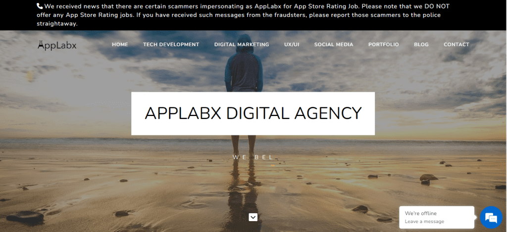
About AppLabx
AppLabx, an industry trailblazer, has been an architect of exquisite websites, mobile apps, and impactful brand launches, fostering client satisfaction from inception.
With a profound commitment to creative craftsmanship, unparalleled client care, and a fervent passion for design, AppLabx has etched its mark in delivering unparalleled tech products and services.
Elegant and Unique Design
AppLabx, with a Design Principle epitomized as “Simple and Sweet,” directs its focus on achieving simplicity and conciseness while preserving the powerful features embedded within each product.
This unique approach results in a harmonious fusion of sophistication and functionality.
Customer Service Excellence
AppLabx extends a round-the-clock commitment to addressing client queries, ensuring uninterrupted operations for businesses. The team tirelessly works while clients rest, guaranteeing seamless support and dedication to client success.
Proven Experience
With a robust track record of developing successful tech products across diverse geolocations, AppLabx excels in adherence to the Agile process and a swift build-to-market mentality.
Their expertise stands as a testament to navigating the dynamic tech landscape with proficiency.
End-to-End Service Integration
AppLabx eliminates the need for clients to search for disparate services.
The company offers comprehensive end-to-end services, encompassing product development, robust marketing facilitated by powerful digital marketing services, and meticulous campaign analysis to optimize product and marketing strategies.
Stick to the End Commitment
From project initiation to conclusion, AppLabx ensures a collaborative journey with clients, defying the trend of abandoning projects when challenges arise.
Cost-Effective Solutions
AppLabx adopts a transparent pricing model, refraining from overcharging or hidden fees. While not positioned as a cheap service provider, AppLabx consistently delivers services that are predominantly ROI-positive, offering clients more value than the investment made.
What can be learned?
Creative Design Aesthetics
AppLabx’s landing page captivates visitors with an innovative blend of creative design aesthetics.
The “Simple and Sweet” design principle is evident, showcasing an elegant and unique visual appeal that effortlessly communicates the brand’s commitment to simplicity without compromising powerful product features.
The seamless integration of sophisticated design elements ensures a visually compelling user experience, setting AppLabx apart in the competitive digital landscape.
User-Centric Navigation
The outstanding user-centric navigation of AppLabx’s landing page enhances the overall browsing experience.
With a clear and concise layout, visitors can effortlessly explore the array of services offered.
The design principle of simplicity extends to the navigation, ensuring that users can easily locate information about AppLabx’s services, customer support, and a portfolio of successful projects.
This user-friendly interface not only engages visitors but also encourages them to delve deeper into the offerings.
Transparent and Compelling Messaging
AppLabx’s landing page stands out with transparent and compelling messaging that communicates the brand’s strengths and values.
Each section is meticulously crafted to deliver key information about the company’s services, customer support availability, extensive experience, end-to-end service integration, commitment to project completion, and cost-effective solutions.
The landing page serves as a digital showcase, effectively conveying the brand’s narrative, instilling trust, and encouraging potential clients to explore further.
The combination of compelling visuals and transparent messaging establishes AppLabx as a trustworthy and innovative player in the tech industry.
2. Grammarly

About Grammarly
The suite of tools crafted by Grammarly is meticulously designed to elevate the efficacy and confidence of individuals in their communication endeavors.
Utilizing Grammarly’s AI-powered communication assistance features has become a commonplace practice for many, aiding in the identification of typos, refining grammar intricacies, and enhancing overall eloquence.
This particular landing page meticulously spotlights Grammarly’s enterprise-centric offering, known as Grammarly Business, with a strategic objective of enticing prospective users to embark on trial engagements.
What can be learned?
In dissecting the effectiveness of this landing page, one observes a deliberate emphasis on visual cohesiveness. The page ingeniously segregates information into distinct, color-coded sections, each catering to a specific function.
This intentional design enables users to seamlessly navigate towards the information most pertinent to their interests.
The narrative of the copy is strategically aligned with the prevalent zeitgeist, focusing predominantly on elucidating how businesses can effortlessly harness Grammarly’s AI capabilities to yield tangible results.
This strategic positioning taps into the contemporary relevance of the topic, addressing a common pain point faced by enterprises in the present landscape.
A noteworthy feature contributing to the efficacy of this landing page is the incorporation of not just logos representing Grammarly’s clientele, but also quotes sourced from specific individuals.
Accompanied by respective photographs, this amalgamation of testimonials and visual representation bolsters the element of social proof. The inclusion of real people and their endorsements engenders a sense of trust, elevating the credibility of Grammarly Business.
In essence, Grammarly’s landing page for Grammarly Business is a masterclass in persuasive design.
Through visual coherence, strategic narrative alignment, and compelling social proof, it successfully navigates the delicate balance of informative content and motivational cues.
Therefore, it ultimately motivates users to embark on trial sign-ups with a heightened level of confidence in the offered solution.
3. Wix
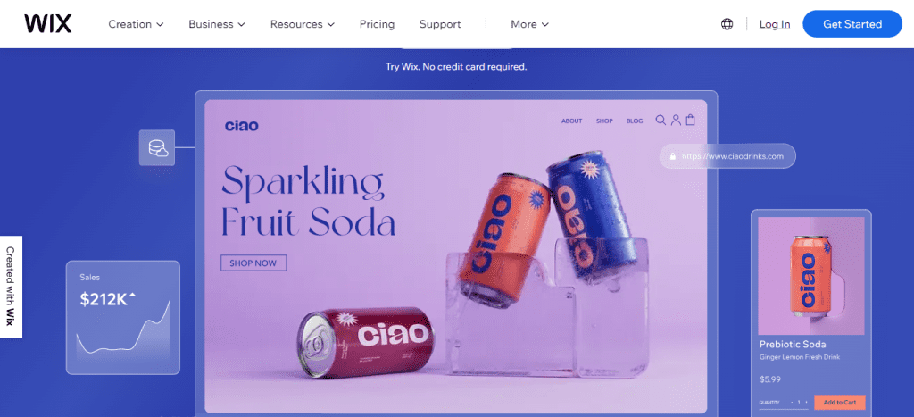
About Wix
Wix stands as a formidable, code-free website construction platform, boasting a comprehensive suite of business tools catering to a spectrum ranging from the simplicity of a personal blog to the complexity of an enterprise-grade online business hub.
Its intrinsic capabilities encompass diverse functionalities, including but not limited to e-commerce, marketing, scheduling, branding, and beyond.
Established as a stalwart in the realm of websites, Wix has consistently held a pioneering role in web design.
Its historical trajectory showcases not only a leadership stance but also an early embrace of avant-garde technologies, exemplified notably by its foray into AI-driven website creation.
What can be learned?
Crafted by Wix’s adept marketing team, this meticulously designed landing page is strategically positioned to captivate potential clients at the nascent stages of their digital business journey.
The content situated “above the fold,” denoting the topmost section of the web page, encompasses quintessential elements requisite for a compelling landing page.
It also includes the company logo, a succinct headline exuding authority, visually engaging content, and a conspicuous CTA.
Crafting a Compelling CTA
The utilization of the imperative message “start now” conveys clarity and instills a sense of urgency.
The judicious choice of a blue color palette creates a visually striking contrast against the backdrop of a light orange hue.
Notably, the strategic placement of the CTA button throughout every section ensures accessibility without necessitating visitors to scroll, enhancing user experience.
Artistry in Visual Engagement
Wix employs a mesmerizing digital illustration that augments the scrolling experience.
The introductory section features a mountainous landscape directing attention to the CTA, where a cascading waterfall seamlessly traverses through subsequent sections.
The imagery of the mountaintop invokes a sense of conquering new heights, symbolically suggesting that visitors will achieve success by aligning with Wix’s services.
Strategic Focus on Key Concepts
Despite the myriad features inherent in the showcased product, the landing page judiciously hones in on the top four, demonstrating a commitment to conciseness and user-friendly navigation.
This deliberate emphasis allows visitors to swiftly peruse the information, enticing them to delve deeper into the intricacies of the product.
In essence, the discerning analysis of Wix’s landing page illuminates strategic principles applicable to any digital business embarkation.
The fusion of compelling CTAs, visually captivating content, and a focused presentation of key concepts collectively form a blueprint for crafting landing pages that transcend mere information dissemination.
Hence, they transform into immersive digital experiences that resonate with and enthrall prospective clients.
4. ExpressVPN
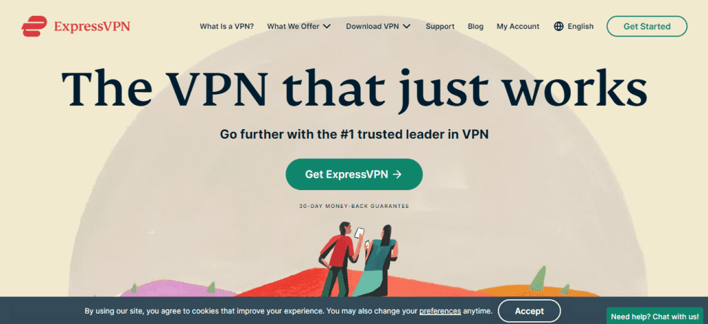
About ExpressVPN
A Virtual Private Network (VPN) serves as a secure conduit connecting your device to the expansive realm of the internet. ExpressVPN operates as an impervious shield, shielding you from unwarranted surveillance, external interference, and potential censorship.
Upon establishing a connection with a fortified VPN server, the trajectory of your internet traffic undergoes a transformative journey through an encrypted tunnel.
This clandestine passageway ensures that the contents of your online activities remain veiled from prying eyes—be they hackers, governmental entities, or even your internet service provider.
The result is a fortified digital perimeter, providing users with a sanctuary of privacy and security in the otherwise open expanse of the internet.
What can be learned?
What distinguishes this particular landing page is not just its content, but rather what it deliberately omits—a navigation bar. ExpressVPN, by eschewing the conventional navigation bar, adeptly directs the spotlight onto its primary Call-to-Action (CTA).
This anti-navigation stance arises from a strategic perspective: traditional navigation bars tend to divert visitors’ attention, potentially steering them away from the desired action.
Beyond being a mere landing page design principle, this approach is fortified by empirical evidence. Rigorous A/B testing conducted indicates a substantial increase in conversion rates upon the removal of navigation links from landing pages.
For those contemplating the adoption of this strategy, the implementation is not merely about removal but also about the judicious choice of a serif typeface.
ExpressVPN’s utilization of such typography conveys a sense of established trust and authority.
It’s a deliberate departure from the prevailing trend characterized by straight lines and sharp edges, encouraging brands to explore a stylistic realm imbued with fluidity and warmth.
By differentiating through typography, brands can evoke a unique visual identity, setting themselves apart in the crowded digital landscape.
5. Blue Apron
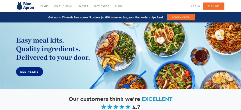
About Blue Apron
Blue Apron, a distinguished entity in the domain of home meal planning and delivery, extends a repertoire of diverse subscription plans to cater to the discerning preferences of its clientele.
Renowned for its culinary prowess, Blue Apron seamlessly integrates the art of meal planning with the convenience of doorstep delivery.
The company’s array of subscription options mirrors a commitment to accommodating varied tastes, dietary preferences, and culinary aspirations among its esteemed customer base.
These meticulously crafted subscription plans serve as a testament to Blue Apron’s dedication to providing a personalized and enriching gastronomic experience for each individual patron.
What can be learned?
Distinguished by its visually luminous and uncluttered presentation, this platform employs high-caliber photography to eloquently exhibit its product offerings.
The accompanying copy adeptly articulates the brand’s extensive spectrum of meal options, emphasizing its capacity to cater to diverse lifestyle preferences and consumer inclinations.
Reinforcing the fundamental value propositions of affordability and convenience, the narrative succinctly encapsulates the essence of the brand.
Strategically, the continuity of a singular Call-to-Action (CTA) reverberates throughout the page, providing visitors with a consistent incentive to navigate further. This deliberate repetition amplifies engagement and encourages a seamless user journey.
Noteworthy is the efficacy with which the page navigates the delicate balance between conciseness and informativeness.
It adeptly highlights pivotal brand and product attributes without succumbing to unnecessary verbosity, ensuring that the user is presented with a comprehensive understanding without the burden of excessive content.
In essence, the page achieves a harmonious blend of visual appeal, compelling narrative, and strategic repetition to enhance user engagement and comprehension.
6. Spatium
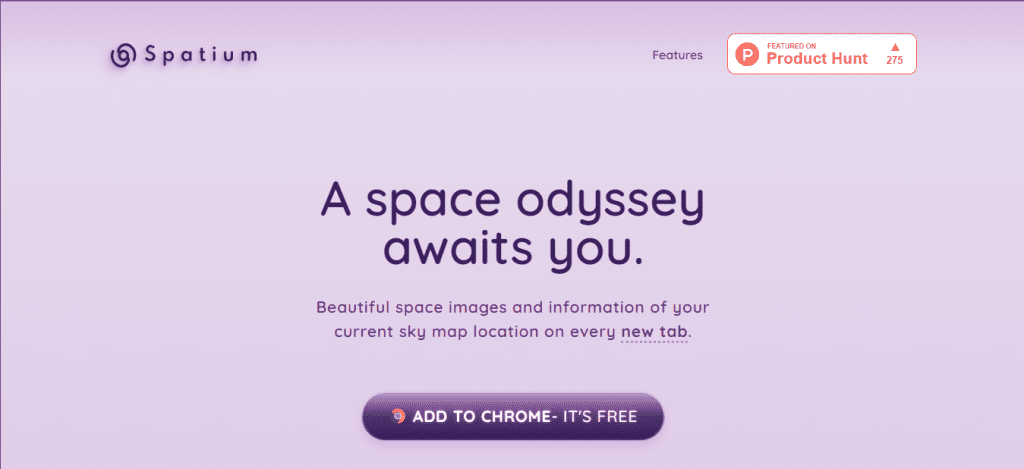
About Spatium
Spatium emerges as an innovative Chrome Extension seamlessly integrating captivating space imagery and informative content pertinent to your present celestial coordinates.
With each new tab, users are greeted by an immersive experience, offering a visual and informational journey into the cosmic realms that align with their current sky location.
This extension transforms the mundane act of opening a new tab into a celestial exploration, enriching the digital landscape with celestial wonders and insightful information.
What can be learned?
An array of captivating shades of purple, coupled with mesmerizing outer space imagery, renders the installation of this Google Chrome extension an irresistible prospect for users.
The deliberate utilization of ample blank space serves to accentuate concise text, culminating in a design that is both alluring and straightforward.
Notably, the Call-to-Action (CTA) strategically emphasizes the extension’s gratuitous nature, providing an added incentive for users.
Delving into the intricacies of the Spatium landing page offers valuable insights:
In this case, it is about simplicity.
The page serves as a testament to the efficacy of simplicity. When the desired user action can be swiftly achieved with minimal risk or cost, the need for excessive elaboration diminishes.
While essential details should be clearly communicated, such as shipping costs or device compatibility, streamlining the user journey ensures a seamless experience.
This approach, as demonstrated by Spatium, facilitates user engagement and bolsters the likelihood of successful conversions.
In essence, the landing page serves as a masterclass in minimalistic design, where visual allure, succinct content, and an uncomplicated user journey coalesce to create an environment conducive to swift and favorable user actions.
7. Squarespace
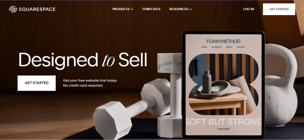
About Squarespace
Renowned as an all-encompassing website creation tool, Squarespace has carved a niche for itself through its superlative design aesthetics.
This widely embraced platform seamlessly facilitates the establishment of a compelling online presence, providing users with the means to efficiently administer and curate their websites.
Beyond its aesthetic prowess, Squarespace further extends its utility by offering robust e-commerce capabilities, rendering it an ideal choice for individuals and fledgling entrepreneurs alike.
The allure of Squarespace extends beyond its stunning designs.
A judicious blend of affordable pricing and an intuitive interface amplifies its appeal, presenting an enticing proposition for those embarking on individual projects or venturing into the realm of entrepreneurial endeavours.
In essence, Squarespace emerges not merely as a website builder but as a comprehensive digital toolkit, empowering users to navigate the complexities of online presence with finesse and style.
What can be learned?
Effortlessly concise and devoid of unnecessary intricacies, this page is a testament to simplicity. Straying from the prevalent trend of perpetual scrolling, all essential information is meticulously presented above the fold, eliminating the need for protracted navigation.
Visually striking, the page employs a dark backdrop, featuring bold white text and a captivating display of scrolling visuals showcasing diverse and aesthetically pleasing website layouts.
This deliberate design choice not only enhances the page’s appeal but also underscores the visual prowess of the featured website layouts.
Despite the paucity of extensive copy, every word serves a purpose.
Emphasizing user-friendly attributes, the provided text accentuates the platform’s ease of use and the absence of cumbersome commitments.
Key phrases such as “Easy-to-edit,” “no coding needed,” and “free trial, no credit card required” act as signposts, guiding users toward a seamless and risk-free engagement.
Even the Call-to-Action (CTA) button aligns with the non-committal ethos, opting for the enticing and exploratory phrase “See templates” rather than prompting users to commit personal details or sign up outright.
This strategic choice not only preserves a sense of autonomy for the user but also encourages exploration without the burden of immediate commitment.
In essence, this page is a masterclass in brevity and effectiveness, skillfully balancing visual allure with compelling, user-centric messaging.
8. Spotify
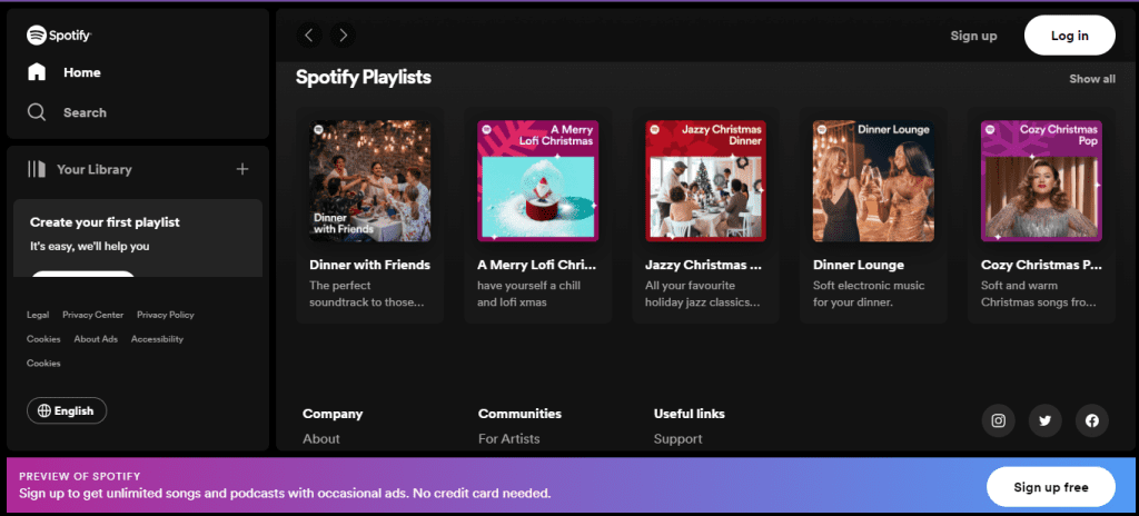
About Spotify
Spotify stands as a formidable digital platform, seamlessly integrating music, podcasts, and videos to grant users access to an extensive library comprising millions of creations from global creators.
Accessible across an array of devices, Spotify transcends the boundaries of traditional platforms, extending its reach to computers, phones, tablets, speakers, TVs, and even automobiles.
What sets Spotify apart is the fluidity afforded by Spotify Connect, facilitating effortless transitions between devices.
This feature, intrinsic to the Spotify experience, ensures a seamless continuum of auditory and visual content as users traverse through the various facets of their digital lives.
What can be learned?
In a bold departure from Spotify’s signature green and black colour scheme, this landing page takes on a distinctive aesthetic, seemingly signalling a departure from its conventional content.
This deliberate departure serves as a visual cue, subtly communicating to visitors that the page is tailored for a unique purpose distinct from the platform’s usual offerings.
While the landing page maintains an air of simplicity, the striking colour contrast serves as a powerful visual element, directing attention to the text and Call-to-Actions (CTAs).
Adding an extra layer of enticement, the page strategically showcases the most played artist, song, album, and podcast of the year — all of which are conveniently accessible on Spotify.
This creative approach not only promotes the richness of Spotify’s content library but also acts as an alluring incentive for visitors to engage further by signing up.
In essence, this landing page represents a deliberate divergence from Spotify’s established visual identity, utilizing color psychology as a subtle tool to differentiate its intent.
The simplicity of design, coupled with strategic content placement, creates a visually compelling and enticing gateway for visitors, inviting them to explore and immerse themselves in Spotify’s diverse content offerings.
9. Khan Academy
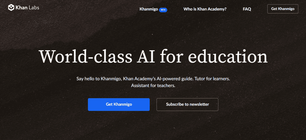
About Khan Academy
Khan Academy, an esteemed educational nonprofit, stands as a beacon of global learning, dedicated to the noble mission of providing free education to students worldwide.
Through its multifaceted approach, Khan Academy delivers a comprehensive educational experience, encompassing exercises, instructional videos, and a diverse array of learning resources.
Hence, it fosters an environment where students can tailor their learning experiences to a pace that aligns with their individual preferences.
What can be learned?
Diverse Calls-to-Action
The page strategically presents two distinct Calls-to-Action (CTAs), providing users with a tailored choice.
The first, adorned with a conspicuous blue button, invites users to “Get Khanmigo” by signing up. Simultaneously, an alternative option encourages users to “Subscribe to the company’s newsletter.”
This thoughtful duality caters to diverse user intentions, ensuring a user-centric approach while benefiting the company.
Elegant and Informative Layout
Embracing simplicity, the page employs a centred layout, maintaining a delicate equilibrium by providing just enough information. It avoids overwhelming users with an excess of links or an inundation of detail.
Each section serves a purpose, delivering a concise yet comprehensive understanding of Khanmigo’s offerings.
Strategic Visual Engagement
Visual elements are employed judiciously, enriching the user experience. An animated representation at the top elucidates the appearance and functionality of Khanmigo.
A video explainer featuring Sal Khan himself further delves into the product’s nuances. Screenshot examples of key features, along with practical demonstrations, occupy the lower section, offering a multi-faceted visual narrative that caters to diverse learning preferences.
In essence, this landing page is a testament to strategic design, presenting a harmonious blend of compelling CTAs, an informative yet uncluttered layout, and a nuanced visual strategy.
It not only invites users to explore Khanmigo but does so in a manner that is user-friendly, engaging, and aligned with the overarching educational ethos of Khan Academy.
Conclusion
A Unified Vision for Digital Excellence
As we traverse the diverse realms of these landing pages, a common thread emerges – the commitment to excellence. Each exemplar, in its unique domain, epitomizes the marriage of aesthetic finesse and functional brilliance.
The lessons gleaned from AppLabx’s innovation, Grammarly’s linguistic mastery, and the culinary tapestry of Blue Apron collectively paint a vivid picture of what digital excellence entails in 2024.
Insights for the Future: A Digital Odyssey Unfurls
The digital landscape is in perpetual flux, and these landing pages serve not just as exemplars but as beacons guiding the way forward.
The insights garnered from the harmonic convergence of Spotify, the security fortification of ExpressVPN and the global educational mission of Khan Academy offer a compass for digital marketers, designers, and creators navigating the future.
SEO-Optimized Visibility: A Digital Epiphany
In the realm of SEO, visibility is paramount. The strategic analysis of these landing pages provides not only inspiration for design and functionality but also a roadmap for enhancing SEO optimization.
The judicious use of keywords, strategic content placement, and user-centric design principles collectively amplify the visibility of these landing pages in the digital landscape.
The Ongoing Digital Renaissance
As we conclude this deep dive into the top landing page examples for 2024, it becomes evident that we are witnessing an ongoing digital renaissance.
The convergence of design aesthetics, user experience, and strategic messaging heralds a new era in digital interactions. The journey doesn’t end with the last click; it’s an ongoing odyssey into the uncharted territories of digital innovation.
A Call to Digital Action
For digital marketers, designers, and enthusiasts alike, the call to action is clear – embrace innovation, prioritize user experience, and let the marriage of form and function guide your digital endeavors.
The insights gained from these landing pages are not just a retrospective; they are a clarion call for a proactive approach to the evolving digital landscape.
A Digital Tapestry Unfurled
In the grand tapestry of digital marketing, these landing pages represent not just isolated examples but interconnected threads weaving a narrative of excellence.
If you are looking for a top-class digital marketer, then book a free consultation slot here.
If you find this article useful, why not share it with your friends and business partners, and also leave a nice comment below?
We, at the AppLabx Research Team, strive to bring the latest and most meaningful data, guides, and statistics to your doorstep.
To get access to top-quality guides, click over to the AppLabx Blog.
People also ask
What is the most important in a landing page?
The most crucial aspect of a landing page is its ability to deliver a clear and compelling message with a concise layout. Engaging visuals, a strong call-to-action, and seamless navigation are vital. A well-designed landing page focuses on user needs, instills trust, and drives conversions effectively.
What is the perfect landing page?
The perfect landing page strikes a balance between captivating design, persuasive content, and a user-friendly layout. It addresses user needs, provides concise information, and guides visitors seamlessly toward a compelling CTA, resulting in high engagement and conversion rates.
What is the best landing page format?
The best landing page format features a clean, visually appealing design, concise yet compelling content, a prominent call-to-action, and mobile responsiveness. It prioritizes user experience, effectively communicates the value proposition, and optimizes for high conversion rates.


 Image Sizes in 2024: The Ultimate Guide")


