Key Takeaways
- Strategic Navigation Matters: Learn from top-performing websites how strategic navigation within FAQ pages enhances user experience, contributing to higher search engine rankings.
- Keyword-rich Answers for SEO Impact: Explore the power of incorporating keywords and internal links within FAQ content to maximize SEO benefits and improve the visibility of your website.
- Identity Integration for Brand Enhancement: Discover how integrating unique values, such as sustainability or brand identity, into FAQ pages can amplify your online presence and resonate with users, leading to increased SEO success.
In the dynamic realm of digital marketing, mastering the art of search engine optimization (SEO) is paramount for businesses aiming to thrive online.
Amidst the increasing saturation of the virtual marketplace, the Frequently Asked Questions (FAQ) page emerges as an often-underestimated asset.
Today, our focus is on unveiling the “Top 7 FAQ Page Examples To Boost Your SEO.”
This exploration promises to delve into the intricacies that transform FAQ pages from mere informational repositories into powerful SEO catalysts.
The SEO Significance of FAQ Pages: Beyond User Queries
The unique ability of FAQ pages to cater to user intent and engagement makes them a standout element in SEO strategies.
A well-structured FAQ page not only streamlines user navigation but also signals to search algorithms that your website is a valuable resource that comprehensively addresses user needs.
Join us as we unravel the secrets behind the success of some of the most adept players in the online arena.
Decoding the SEO Strategies: Elements of a Dynamic FAQ Page
Our journey through the world of FAQ pages will involve dissecting and analyzing the strategies employed by industry leaders.
From user-centric design to keyword integration, we’ll unravel the elements that transform a mere FAQ page into a dynamic SEO powerhouse.
Through the lens of the “Top 7 FAQ Page Examples,” we will provide tangible insights and actionable takeaways.
Whether you’re a seasoned SEO professional, a business owner, or a curious enthusiast eager to optimize your online presence, this exploration promises to equip you with a nuanced understanding of FAQ pages and their undeniable impact on SEO.
Crafting FAQ Pages for SEO Success: The User Experience Nexus
The central nexus of a successful FAQ page lies in its user-centric design and navigational clarity.
As we explore the “Top 7 FAQ Page Examples,” we’ll showcase how leading entities have seamlessly integrated information, ensuring relevance and ease of access for their users.
We will analyze the positive impact of user-friendly FAQ pages on SEO rankings, emphasizing the crucial role these pages play in enhancing overall user experience and engagement.
Learn how to craft a FAQ page that not only addresses common user queries but also propels your website to higher echelons in search engine results.
Benchmarking SEO Success: Examples from Industry Leaders
Our journey into the SEO-optimized realm of FAQ pages wouldn’t be complete without a deep dive into real-world examples.
Through the exploration of seven exemplary FAQ pages, we’ll uncover the unique features, innovative approaches, and SEO benefits that have propelled these companies to the forefront.
From established brands to emerging players, these case studies will provide a holistic view of how FAQ pages contribute to overall SEO success.
Be prepared to glean insights from the best in the business and apply these lessons to elevate your own FAQ page strategy.
Empowering Your SEO Journey: Closing Thoughts
Whether you’re a digital marketing professional, business owner, or SEO enthusiast, the fusion of functionality and optimization explored in “Top 7 FAQ Page Examples To Boost Your SEO” offers a roadmap for success.
The digital terrain awaits your exploration, armed with newfound knowledge and insights that promise to elevate your online presence. Get ready to transform your FAQ page into a potent SEO ally and witness the convergence of information and innovation.
But, before we venture further, we like to share who we are and what we do.
About AppLabx
From developing a solid marketing plan to creating compelling content, optimizing for search engines, leveraging social media, and utilizing paid advertising, AppLabx offers a comprehensive suite of digital marketing services designed to drive growth and profitability for your business.
AppLabx is well known for helping companies and startups use website marketing to drive web traffic to their websites and web apps.
At AppLabx, we understand that no two businesses are alike. That’s why we take a personalized approach to every project, working closely with our clients to understand their unique needs and goals, and developing customized strategies to help them achieve success.
If you need a digital consultation, then send in an inquiry here.
Top 7 FAQ Page Examples To Boost Your SEO
1. McDonald’s
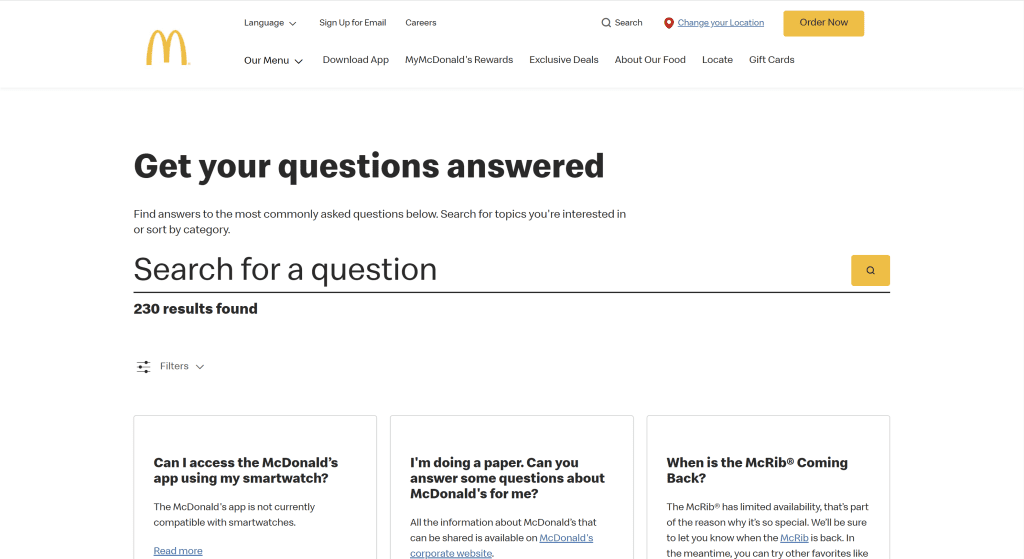
Unveiling McDonald’s Robust FAQ Infrastructure
Within the expansive labyrinth of McDonald’s primary FAQ page, one cannot overlook the prominence of its colossal search bar.
Even in the event that a visitor might inadvertently overlook this conspicuous feature, McDonald’s astutely incorporates a substantial yet informative prompt, subtly guiding users to employ the search function in quest of their queries.
Strategic Implementation of Search Bar for Organizational Excellence
The decision to integrate a search bar within McDonald’s extensive FAQ page is a judicious one, primarily fostering organizational coherence.
The juxtaposition of the top three questions, as depicted above, seems disjointed, lacking apparent thematic connections or alignment with the presumed popularity of inquiries received by McDonald’s support services.
Navigational Ingenuity: The Crux of McDonald’s FAQ Brilliance
Despite the seemingly disparate nature of the top questions, McDonald’s FAQ page shines in its navigational finesse.
The profound search and filtering capabilities afford users a seamless experience, showcasing McDonald’s commitment to ensuring efficient access to information.
In the intricate tapestry of frequently asked questions, McDonald’s emerges as an exemplar of navigational ingenuity, substantiating the assertion that, despite apparent disconnections, the fast-food giant executes commendable work within the realm of FAQs.
2. Microsoft
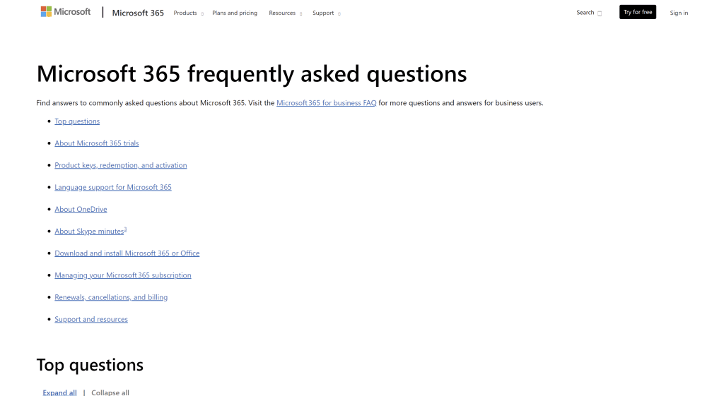
Revolutionizing Microsoft’s FAQ Architecture: A Shift to Service-Centric Pages
Microsoft has undergone a notable transformation in its FAQ strategy by decentralizing its once overly centralized FAQ hub, now assigning a dedicated FAQ page to each of its diverse services.
This strategic shift is particularly apt for companies with an extensive array of intricate products, promoting a more focused and tailored user experience.
One such illustrative example is the Microsoft 365 FAQ page, where a sophisticated navigation bar adorns the apex, housing a myriad of questions meticulously categorized for enhanced accessibility.
Strategic Embrace of Top Questions: Enhancing User Engagement
A commendable facet of Microsoft’s FAQ redesign lies in the incorporation of a “Top Questions” section within each category, strategically extracting the most frequently asked queries and positioning them prominently at the page’s forefront.
This thoughtful curation ensures that users can swiftly access the most sought-after information, streamlining their navigation experience and contributing to heightened user engagement.
Limitations in Search Functionality: Unveiling the Hidden Answers
While Microsoft’s service-centric FAQ pages showcase commendable features, such as the prioritization of top questions, a noteworthy drawback surfaces in the limited search functionality.
Unlike fully searchable interfaces, Microsoft’s FAQ design requires users to expand dropdown sections to reveal answers, introducing an additional step in the search process.
This nuanced limitation highlights an area for potential enhancement in Microsoft’s ongoing pursuit of optimal user-centric FAQ experiences.
3. Wikipedia
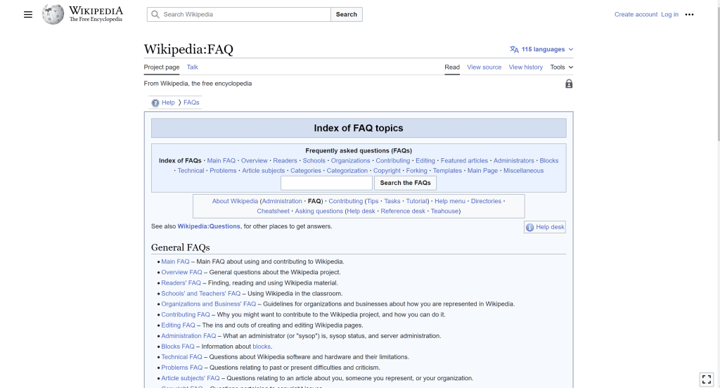
Wikipedia’s Exemplary FAQ Infrastructure: Harmonizing Design and Functionality
Wikipedia’s primary FAQ page stands as a testament to meticulous design, seamlessly integrating with the overall aesthetic of the site.
Aesthetically aligned with the familiar Wiki format, the page offers an immediate sense of familiarity, ensuring a user-friendly experience.
Beyond its visual coherence, this FAQ page distinguishes itself through its comprehensive search functionality, both on-page and through browser search options.
True to the nature of Wikipedia, the answers are concise yet enriched with internal links, facilitating seamless navigation within the vast expanse of information.
Navigational Precision: The Wikipedia FAQ Index Page
While the inherent challenge lies in the impossibility of listing every question for each FAQ, the page employs strategic keywords to guide users effectively.
This strategic approach ensures users can swiftly identify and navigate to the relevant FAQ, thereby streamlining their quest for information across a myriad of potential use cases.
Strategic Keywords and User Guidance: Elevating the FAQ Experience
The brilliance of Wikipedia’s FAQ index page lies in its judicious use of strategic keywords, serving as beacons guiding users to the right FAQ for their specific needs.
This method transcends the limitations of listing every question for each FAQ, offering a pragmatic solution that aligns with Wikipedia’s commitment to user-centricity.
In this nuanced interplay of design and functionality, Wikipedia sets a high standard for FAQ infrastructure, combining the elegance of presentation with the precision required for optimal user guidance.
4. Zappos
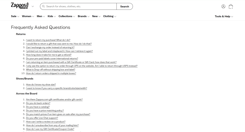
Zappos FAQ Page: Emphasizing Utility Over Aesthetics
In a departure from visually enticing designs, the Zappos FAQ page distinguishes itself through its unwavering commitment to utility. While it may not win accolades for attractiveness, it excels in functionality.
The navigation section at the top is a model of organization, presenting every question meticulously categorized for user convenience.
Each question is thoughtfully linked, eliminating any friction in navigation. As users scroll down, the absence of collapsible menus ensures a seamless on-page searching experience, allowing users to effortlessly locate the information they seek.
In-Depth Information Accessibility: Streamlined On-Page Searching
Zappos goes beyond the conventional by offering a user-friendly on-page searching experience.
The absence of collapsible menus means that users can readily view complete questions and answers without the need for additional clicks.
This strategic design choice enhances user engagement, facilitating quick access to information. Zappos acknowledges the value of time and simplicity, streamlining the user journey and positioning information for easy consumption.
SEO Optimization: Elevating the Zappos FAQ Page Value
Beneath the surface utility, the Zappos FAQ page unfolds as a treasure trove of SEO value. Each answer is not merely a response but a strategically crafted, keyword-rich entity.
The incorporation of internal links seamlessly directs users to other relevant Zappos web pages, establishing a network of interconnected information.
This deliberate approach significantly enhances the SEO value of the FAQ page, positioning it as not just a repository of answers but a strategic asset in Zappos’ digital landscape.
5. Parade
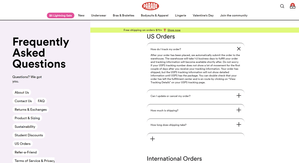
Parade’s Navigational Excellence: Leveraging Left Column Buttons
Parade, a direct-to-consumer underwear brand, exhibits commendable navigation on its FAQ page, primarily owed to the strategically placed buttons in the left column.
These navigational aids contribute to a seamless user experience, ensuring that customers can effortlessly locate and access relevant information.
While the dropdown menu might present an opportunity for enhancement, Parade’s discerning approach to navigation sets a noteworthy standard for clarity and accessibility.
Strategic Sustainability Section: Elevating the Brand Narrative
Parade’s sagacity shines through in the inclusion of a dedicated section on sustainability within its FAQ page.
As a brand that positions itself as a sustainable underwear company, Parade not only markets itself on this unique value but also takes the extra step of detailing its sustainability efforts in a public and visible space.
This strategic move goes beyond mere self-proclamation, potentially persuading skeptics that Parade is genuinely committed to practicing what it preaches.
In an era where consumers increasingly prioritize sustainable practices, Parade’s transparency becomes a significant differentiator.
Amplifying Brand Values: Showcasing Uniqueness on the FAQ Page
For brands like Parade, whose identity rests on unique values, integrating a dedicated section in the FAQ page to spotlight and elaborate on these values is a strategic imperative.
Parade’s emphasis on sustainability is not confined to marketing rhetoric but finds a tangible presence in a section accessible to all.
This nuanced approach adds depth to the brand narrative, offering customers a comprehensive understanding of the values that set Parade apart.
This practice stands as a valuable lesson for other brands to consider, as it fosters transparency, builds trust, and reinforces the brand’s distinct identity in the minds of consumers.
6. AdEspresso
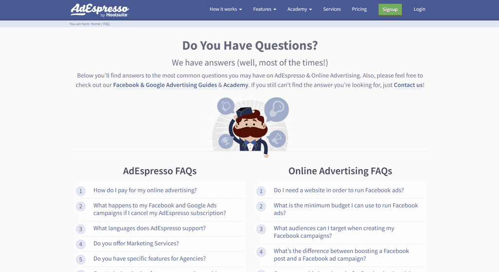
AdEspresso’s Pursuit of Simplicity: An Effective FAQ Approach
In its pursuit of simplicity, the Ad campaign company, AdEspresso, strategically curates a FAQ page with a limited yet impactful selection of questions and answers.
The intentional scarcity of content serves a purpose – each question, when selected, directs users to a micro-blog on the respective topic, teeming with hyperlinks for deeper exploration.
This micro-blog approach not only answers the immediate query but also offers users an avenue to delve into related information seamlessly.
Comprehensive Resource Navigation: Beyond the FAQ Horizon
AdEspresso’s FAQ page doesn’t merely end with the listed questions; it serves as a gateway to a broader knowledge ecosystem.
For those with queries beyond the FAQ page scope, AdEspresso provides clear signposts to additional resources.
The introductory paragraph guides users toward the company’s Facebook & Google Advertising Guides and Academy pages, offering a wealth of supplementary information.
Furthermore, a direct link to AdEspresso’s contact page ensures that users have an accessible channel for personalized assistance.
A User-Centric FAQ Experience: Straightforward, Intuitive, and Helpful
The resulting FAQ page from AdEspresso encapsulates the essence of user-centric design—straightforward, intuitive, and genuinely helpful.
Its deliberate simplicity doesn’t compromise effectiveness; instead, it amplifies user experience by seamlessly guiding them through relevant information.
By providing clear pathways to additional resources and offering a direct line of communication, AdEspresso’s FAQ page embodies attributes that any customer, irrespective of expertise level, can appreciate.
7. Airtable
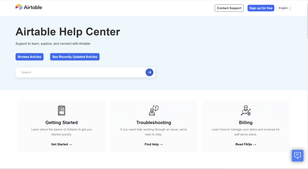
Strategic Integration: Airtable’s FAQs within the Comprehensive Help Center
Airtable, a leading cloud collaboration company, strategically situates its FAQs within the larger framework of its help center, providing customers with an extensive repository of information.
This deliberate integration enhances the likelihood of users finding the answers they seek without necessitating direct contact with a representative.
Placing FAQs within the broader help center signifies Airtable’s commitment to comprehensive customer support, ensuring users have access to a wealth of resources to address their queries.
Diverse Information Ecosystem: Beyond FAQs in the Help Center
While the FAQ section is a pivotal component, Airtable goes above and beyond by offering visitors a diverse array of resources beyond FAQs. Users can explore guides, recorded video webinars, how-to articles, and more, fostering a rich and varied knowledge ecosystem.
While this abundance of information might initially appear overwhelming, Airtable employs a strategic approach to guide users effectively, ensuring they can navigate through the diverse resources with ease.
Guided Navigation: FAQs as Pathways to Relevant Information
Navigating through an extensive help center might seem daunting, but Airtable leverages its FAQs to serve as effective signposts, guiding customers to the right destination.
Each FAQ answer serves not only as a resolution to the immediate query but also as a gateway, seamlessly linking users to additional articles or relevant pages on the site.
This meticulous interlinking eliminates the guesswork for users, offering a streamlined path to more in-depth information and resources.
Conclusion
In the realm of digital landscapes, where the symbiotic relationship between user experience and search engine optimization (SEO) defines success, the exploration of the “Top 7 FAQ Page Examples” unveils a mosaic of innovation, functionality, and strategic acumen.
We collectively dissect the FAQ pages of industry giants such as McDonald’s, Microsoft, Wikipedia, Zappos, Parade, AdEspresso, and Airtable,
A tapestry of best practices and diverse approaches emerges, offering profound insights for businesses aiming to enhance their online visibility and user engagement.
Diverse Navigational Strategies: A Lesson from McDonald’s and Microsoft
McDonald’s, with its strategically positioned search bar and navigational clarity, sets a benchmark in user-centric design.
Microsoft’s evolution from a centralized FAQ hub to service-centric pages underscores the importance of aligning FAQ architecture with the intricacies of diverse products.
These industry giants showcase that diverse navigational strategies, tailored to user needs, contribute significantly to SEO prowess.
Transparency and Identity: Wikipedia’s Unconventional Approach
Wikipedia, known for its wealth of information, doesn’t disappoint in its FAQ page. While adhering to its signature simplicity, Wikipedia stands out by utilizing a fully searchable interface, fostering an environment where users can seamlessly access exhaustive information.
Transparency about sustainability practices, as exemplified by Parade, adds a layer of identity to the FAQ, resonating with users who seek authenticity in brand values.
Strategic SEO Integration: Zappos’ and AdEspresso’s Keyword-rich Approaches
Zappos, despite its minimalist approach, exemplifies the power of strategic SEO integration. The absence of collapsible menus enhances on-page searching, providing users with immediate access to complete questions and answers.
AdEspresso takes a micro-blog approach, interlinking answers with keywords and internal links, solidifying its FAQ page as an SEO powerhouse, ripe with opportunities for exploration.
Highlighting Unique Values: Parade’s and Airtable’s Distinctive Narratives
Parade masterfully integrates sustainability into its FAQ, showcasing that emphasizing unique values adds depth to the brand narrative.
Airtable strategically positions FAQs within a broader help center, providing users with an immersive ecosystem of resources. By doing so, both Parade and Airtable transcend the FAQ’s traditional role, shaping it into a strategic tool for brand identity and comprehensive support.
In the grand ensemble of the “Top 7 FAQ Page Examples,” the amalgamation of approaches and practices not only emphasizes the pivotal role FAQs play in SEO but also illuminates the potential for innovation and differentiation within this seemingly standard feature.
These exemplary models stand as guiding beacons, offering a roadmap to transform FAQ pages from mere repositories to dynamic assets that elevate user experience, reinforce brand identity, and, ultimately, boost SEO success.
As the digital landscape continues to evolve, the lessons gleaned from these industry leaders will undoubtedly inspire businesses to redefine their approach to FAQs and unlock new dimensions in the pursuit of online excellence.
If you are looking for a top-class digital marketer, then book a free consultation slot here.
If you find this article useful, why not share it with your friends and business partners, and also leave a nice comment below?
We, at the AppLabx Research Team, strive to bring the latest and most meaningful data, guides, and statistics to your doorstep.
To get access to top-quality guides, click over to the AppLabx Blog.
People also ask
Are FAQ pages good for SEO?
Absolutely. FAQ pages enhance SEO by addressing user queries, improving site navigation, and providing keyword-rich content. They signal search engines about your site’s relevance, contributing to higher rankings and increased visibility. Elevate your SEO game with a well-crafted FAQ page.
How do I make an SEO-friendly FAQ page?
Craft an SEO-friendly FAQ page by using clear headings, incorporating relevant keywords, and providing concise yet informative answers. Ensure easy navigation, employ schema markup, and regularly update content. Engage users with multimedia, and leverage internal linking for optimal SEO impact.
How to make FAQs?
To craft effective FAQs, identify common user queries, structure questions clearly, and provide concise, informative answers. Optimize content with relevant keywords, maintain a user-friendly format, and consider multimedia elements. Regularly update FAQs to align with evolving user needs for maximum impact.


